DATE
2023
Bitcoin Suisse Investment platform
Redesigning the Bitcoin Suisse Portfolio experience to make it more clear, modern, and trustworthy. We updated the UI, exposed real performance signals, and fixed structural issues so clients finally see accurate totals across vault, staking, and portfolio.
Investment platform
Crypto Finance
Role
Senior Product Designer
Category
Crypto Exchange
Company
Bitcoin Suisse
Tools
Figma, User Interviews, Workshops
Team
1 Product Designer, 3 Engineers
Timeline
10 Months
Overview
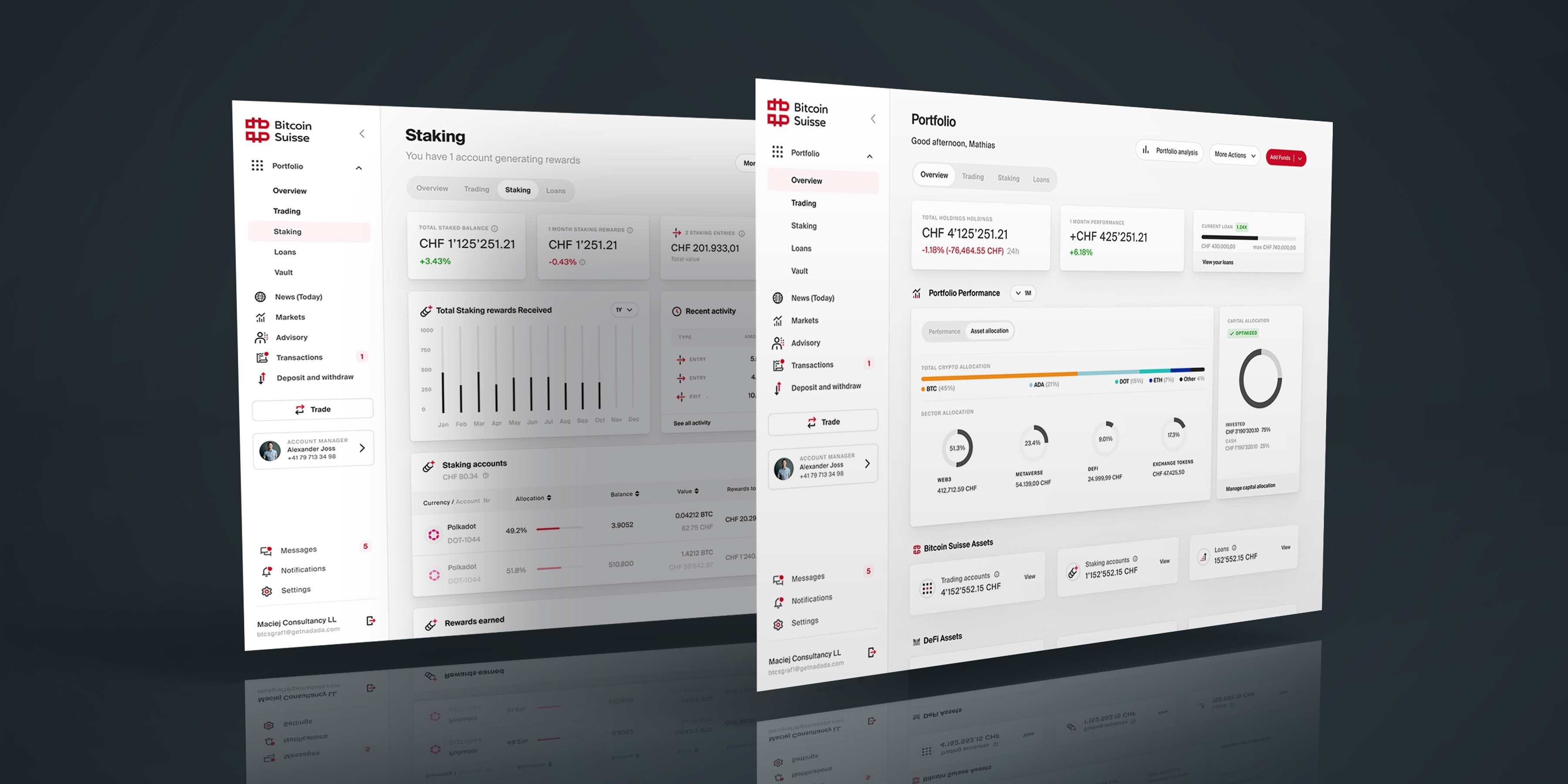
The portfolio felt dated and confusing—no charts or allocation, scattered holdings, and odd negative balances for loan clients. I partnered with stakeholders to turn fragmented feedback into a clear product story: one consolidated portfolio, readable metrics, sane notation, and navigation that supports accurate totals and simple actions.
Problem
No clear overview: missing charts, allocation, and performance metrics
Fragmented holdings: vault, staking, and portfolio split “total holdings”
Incorrect loan logic: negative totals undermined trust
Over‑precise decimals: hard to scan, easy to misinterpret
Navigation mismatch: structure didn’t support a single source of truth
Opportunity
Create a modern, scan‑first portfolio that consolidates assets, shows real performance and allocation, fixes loan representation, reduces crypto decimal noise, and restructures navigation to support accurate totals and faster decisions.
My impact
Unified portfolio model across vault, staking, and portfolio
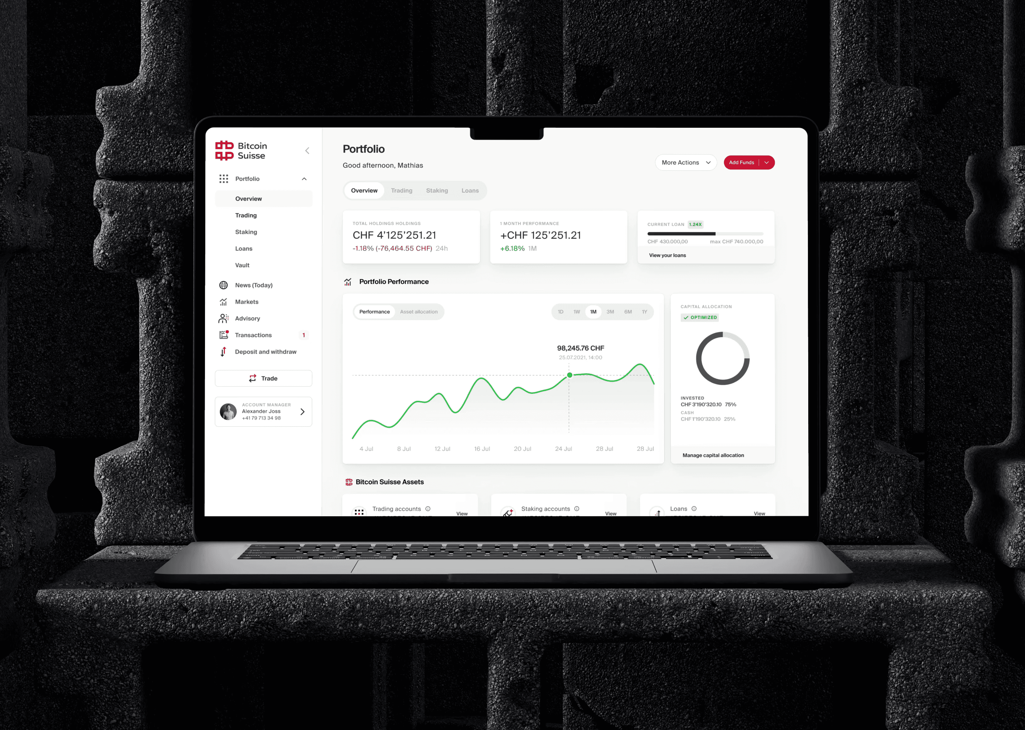
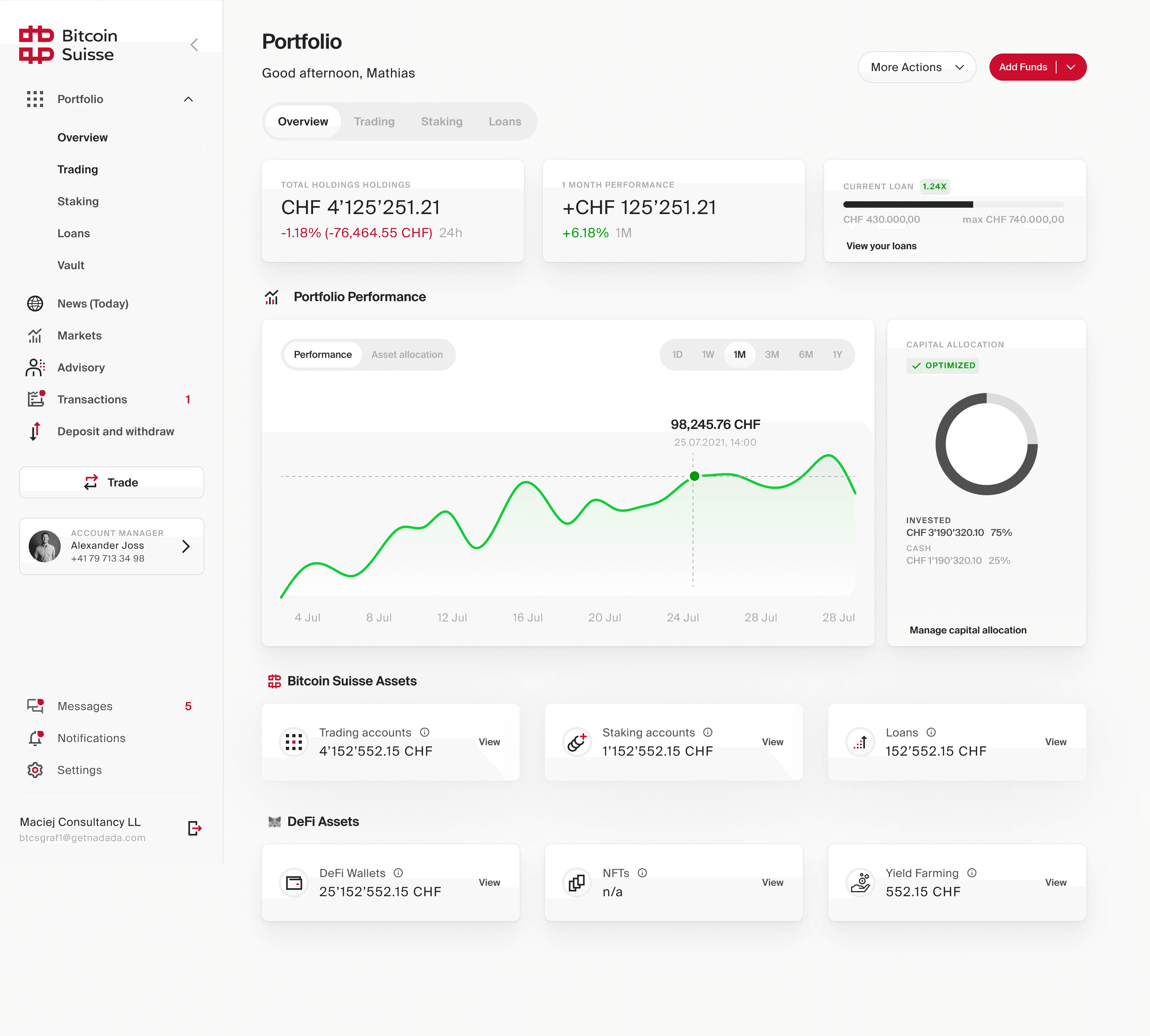
I created a single holdings model that merges all asset categories. This removed duplicated totals and provided one clear location for a client's real balance.
Accurate total calculation and corrected loan logic
I clarified asset versus liability behaviour, fixed negative balance issues, and made totals consistent across screens. This directly improved trust in the product.
Decimal rules and a readable numeric system
I introduced clear precision guidelines for crypto and fiat values. The result is clean, scannable balances without distracting decimal noise.
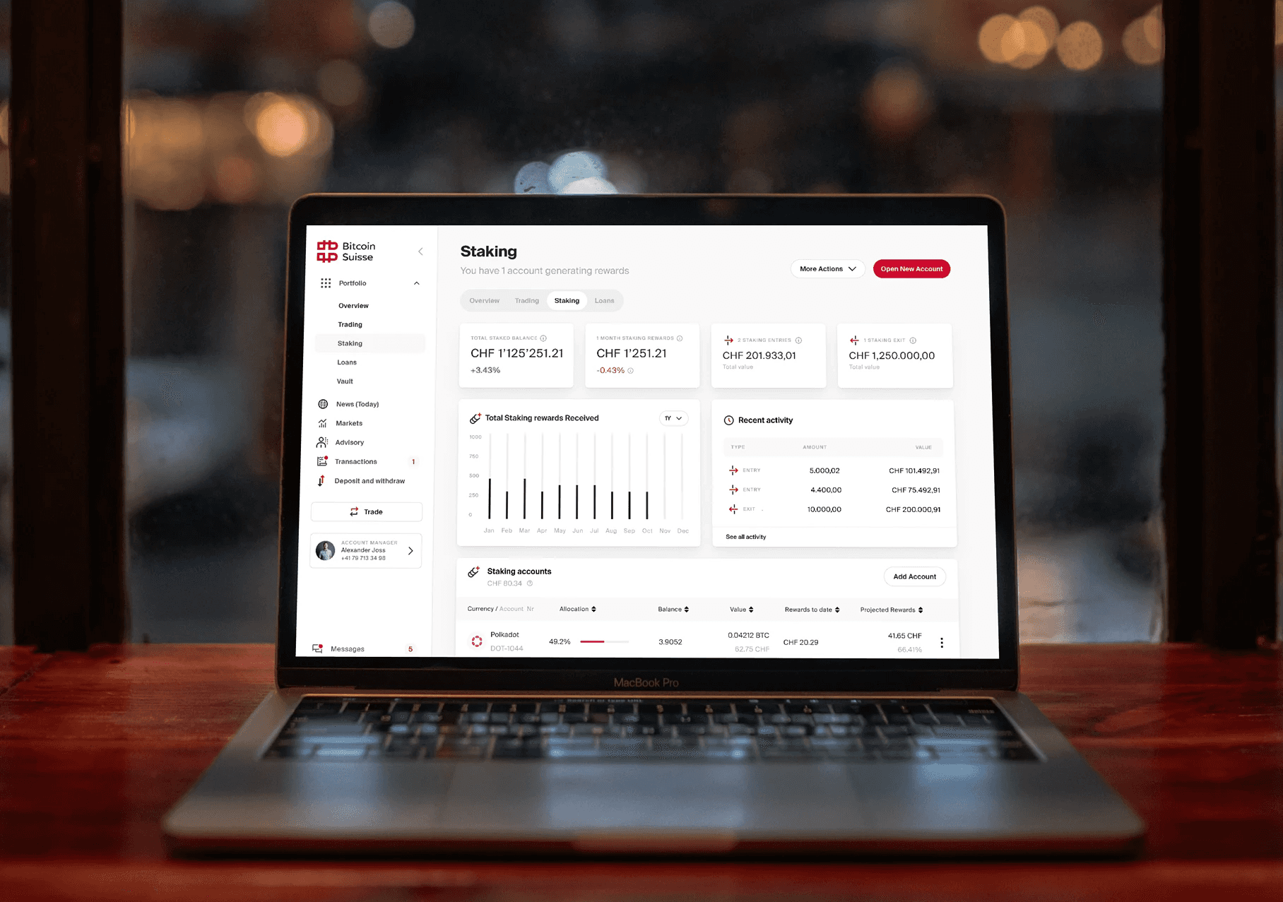
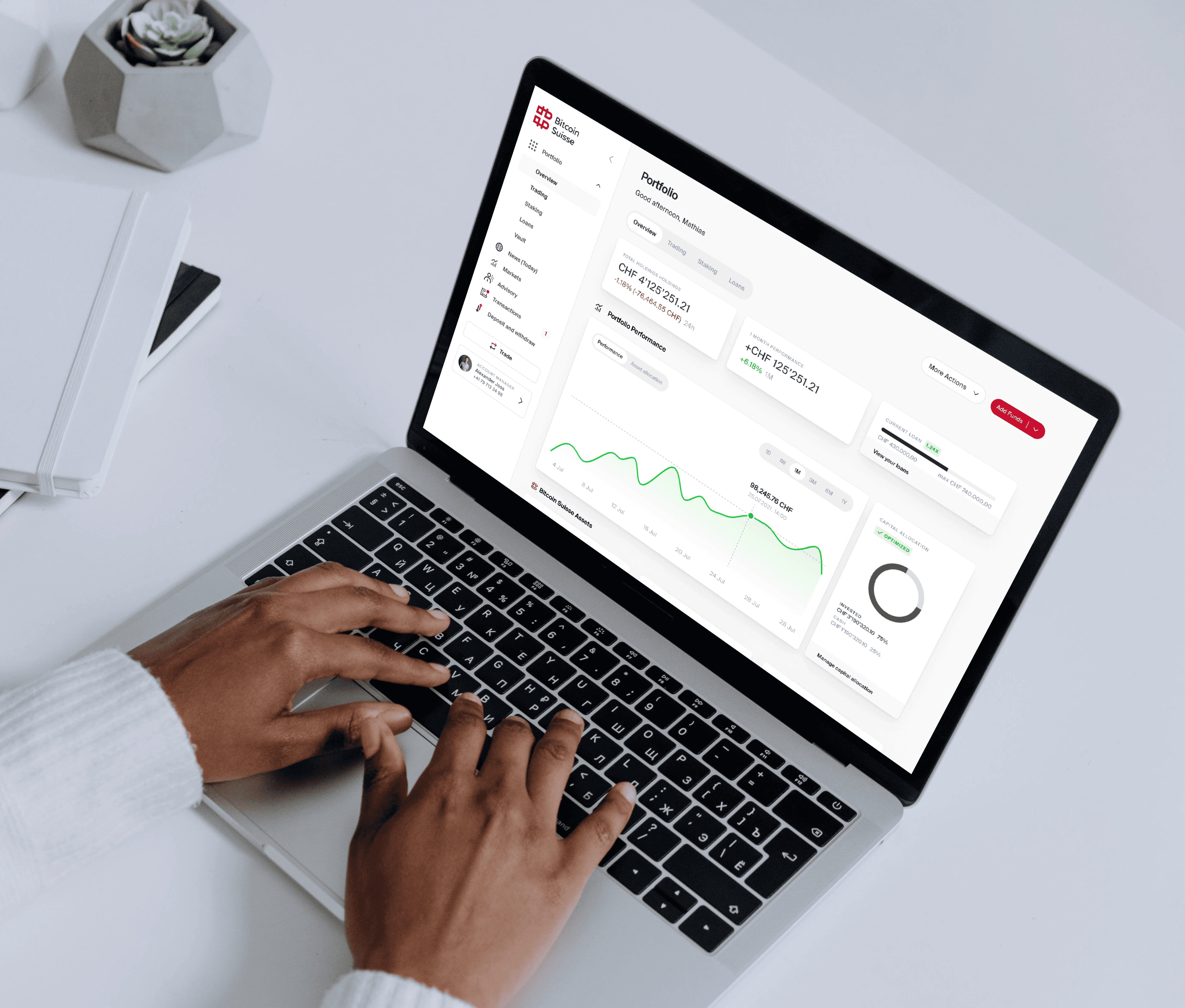
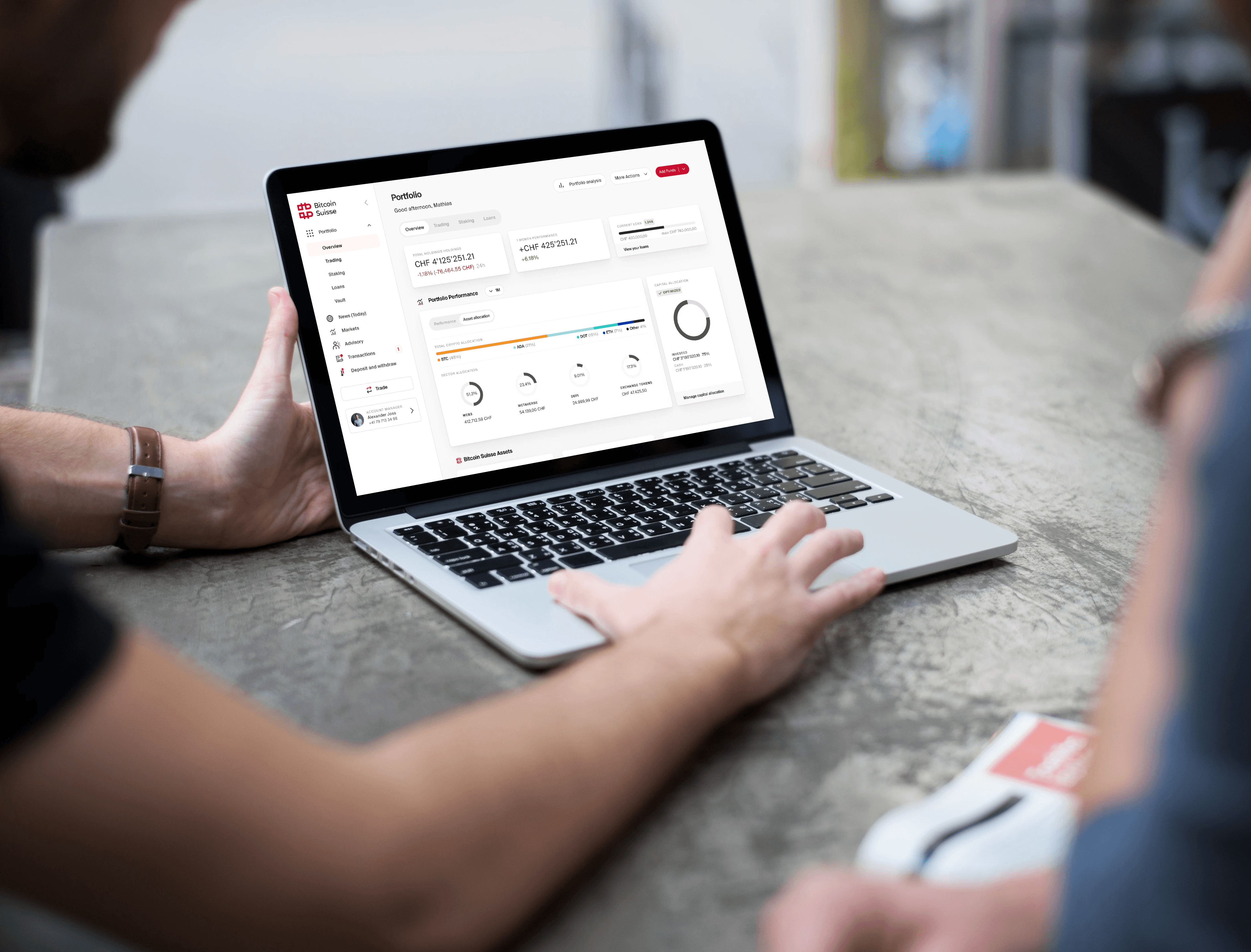
Performance charts and allocation visualisation
I added charts and allocation views so clients can see how their portfolio is performing at a glance. This replaced a static list with signals that inform real decisions.
Modernised UI and refined visual hierarchy
I redesigned the portfolio interface with balanced information density, modern visuals, and better spacing. The UI finally matches the expectations of a premium wealth platform.
Navigation redesign aligned with the new data model
I rebuilt the left navigation so it supports consolidated holdings, correct account grouping, and consistent access to actions like deposit, withdraw, and trade.
Multi-account behaviour and an L3 analysis page
I defined rules for clients with multiple accounts and delivered a deeper analysis view for advanced users. These features help private and corporate clients without cluttering the primary portfolio.
Component standards and consistent interaction patterns
I documented standardised component states, behaviour rules, and analysis patterns. This ensured predictable interactions and reduced engineering guesswork.
Process
Discover
Gather Relationship Manager feedback and stakeholder inputs, analyze GA user flows for drop‑offs, and survey 200+ colleagues to pinpoint what blocks a clear, trustworthy portfolio.
Design & Architect
Define a consolidated holdings model (vault + staking + portfolio), fix loan vs asset representation, set readable decimal rules, restructure navigation, and prototype key flows (multi‑account logic, L3 analysis).
Deliver & Validate
Ship the redesigned portfolio UI (charts, allocation, clearer numbers) and iterate with stakeholders against competitor baselines until totals, metrics, and behaviors are consistent across scenarios.
Diving deep: uncovering portfolio pain points
RESEARCH
At the start of the project, I led our team in exploring the portfolio section's landscape. We used a mix of research methods to understand its current state and identify the most common challenges users faced. This foundational work set the stage for designing meaningful improvements.
Turning client feedback into actionable insights
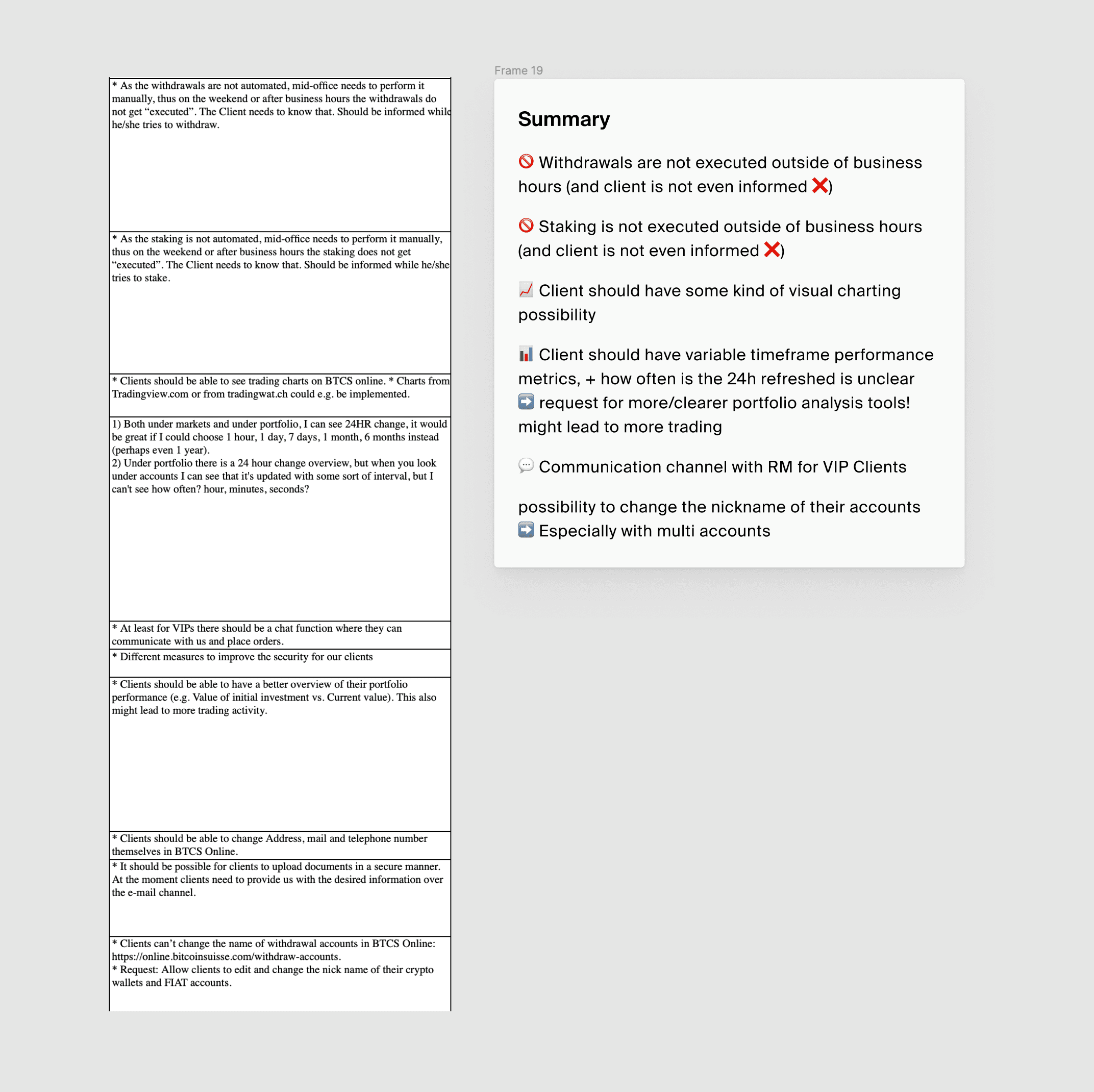
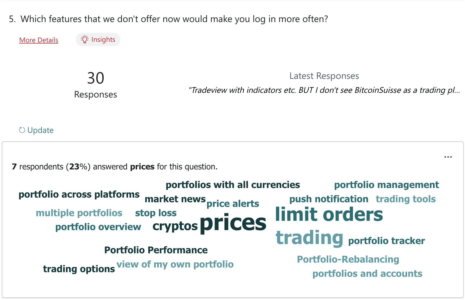
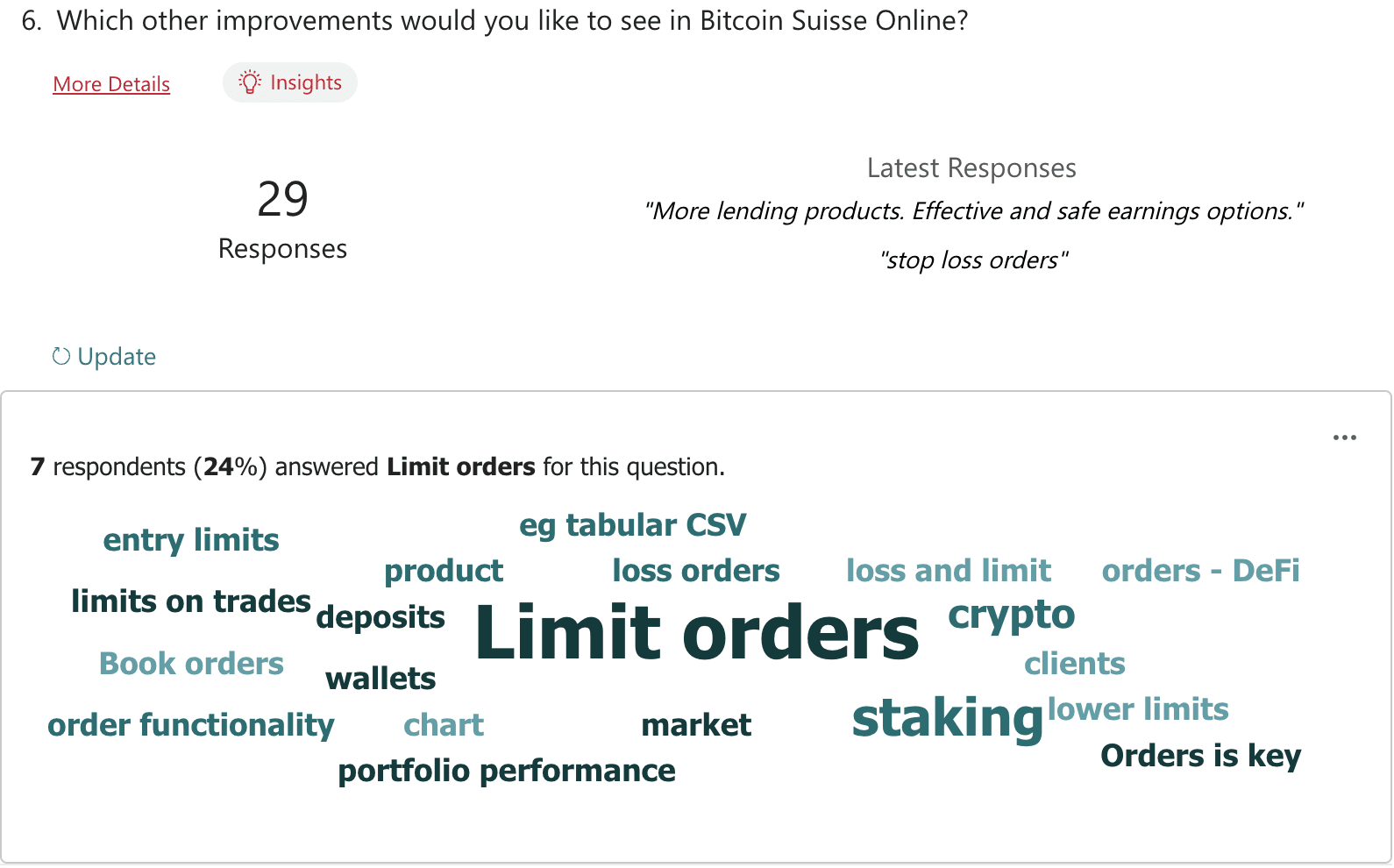
Our relationship managers played a key role by sharing a "frequently asked features" file, giving us direct access to the most common client requests. Analyzing this file helped us understand real user needs and set clear priorities for our design process.
Ideation and prio-workshop
We brought together key stakeholders for a lively online workshop. Through rapid ideation and prioritization exercises, our team uncovered the core challenges and clarified the project scope, laying a strong foundation for the journey ahead.
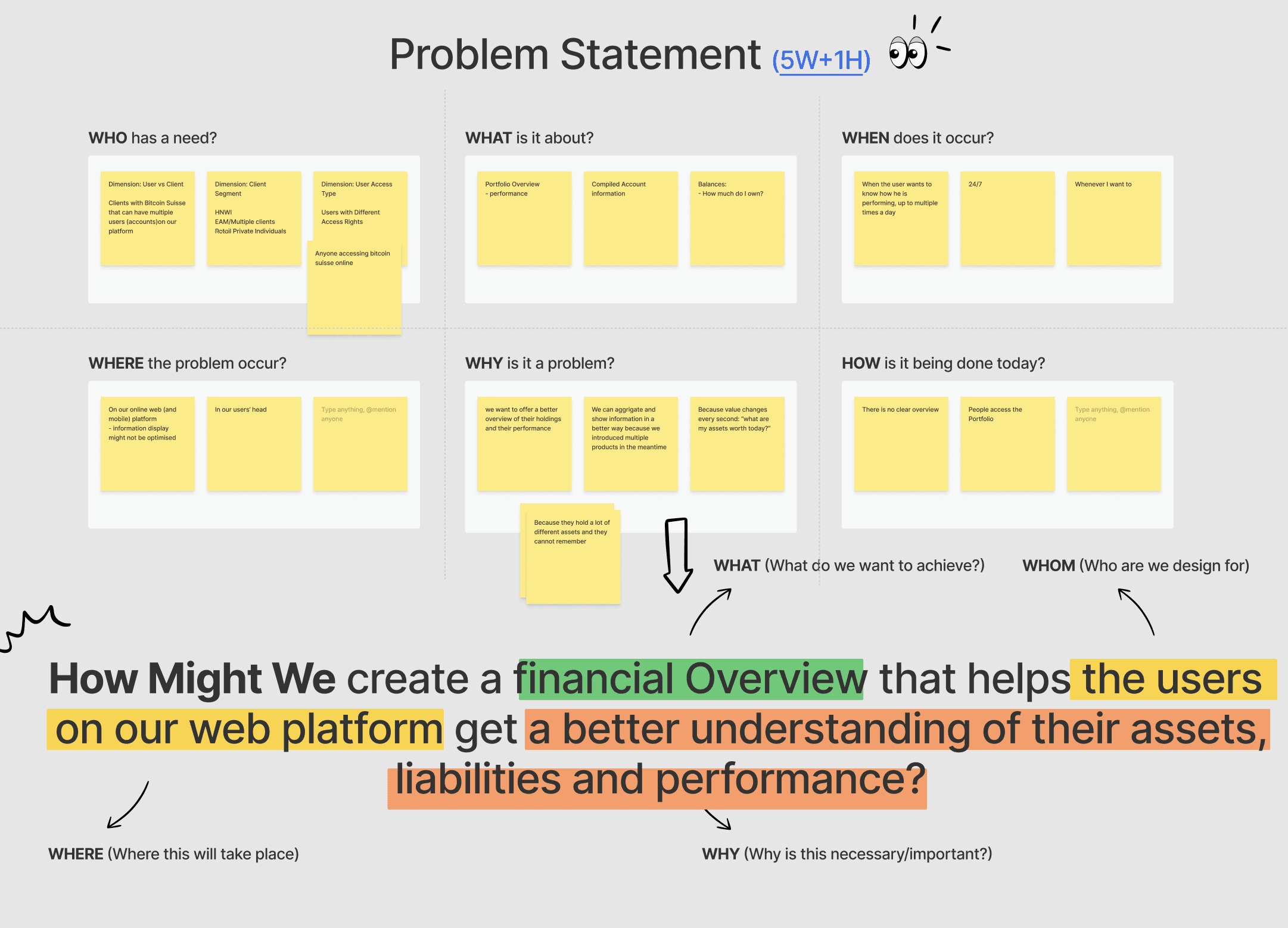
Started from the Problem statement
To get everyone on the same page, we jumped into FigJam and crafted our problem statement with the 5W+1H framework (qué?).
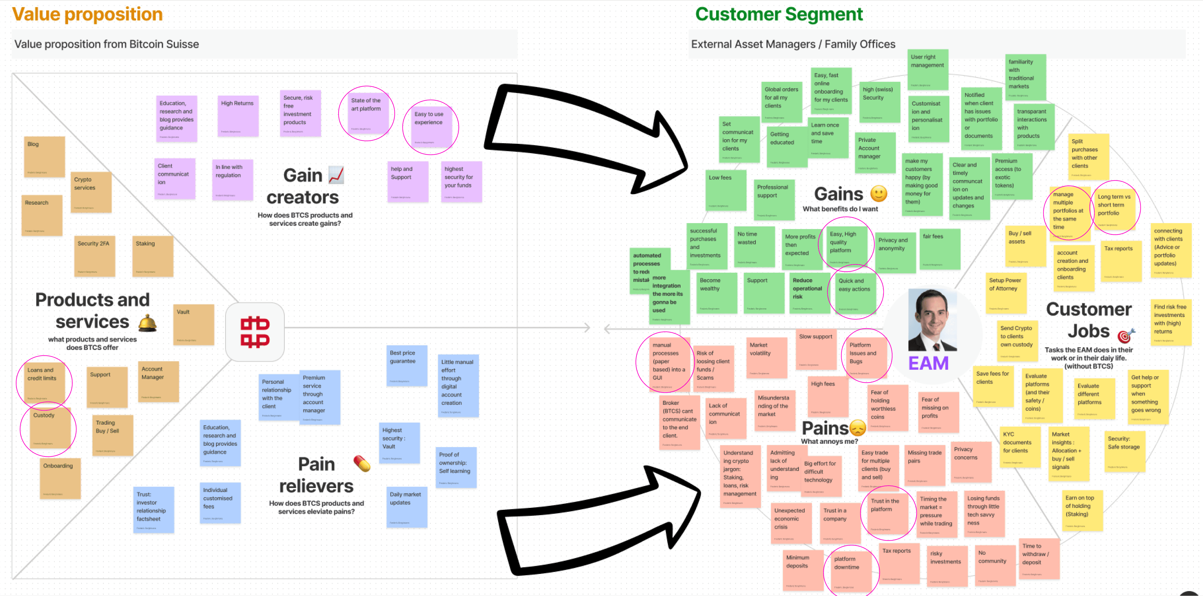
Building on this foundation, we also brought back the Value Proposition Canvas to deepen our understanding.
How user insights shaped the redesign
ANALYSIS
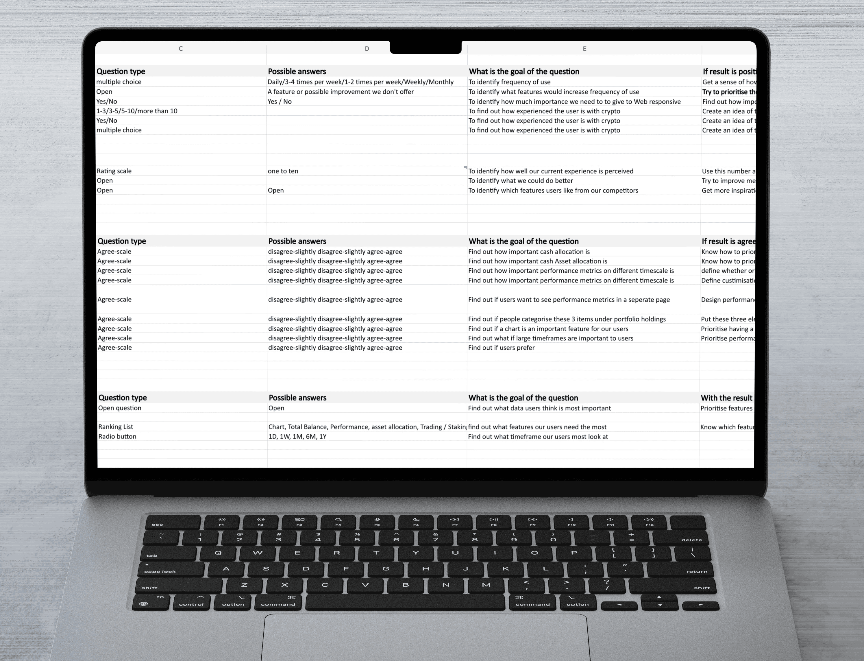
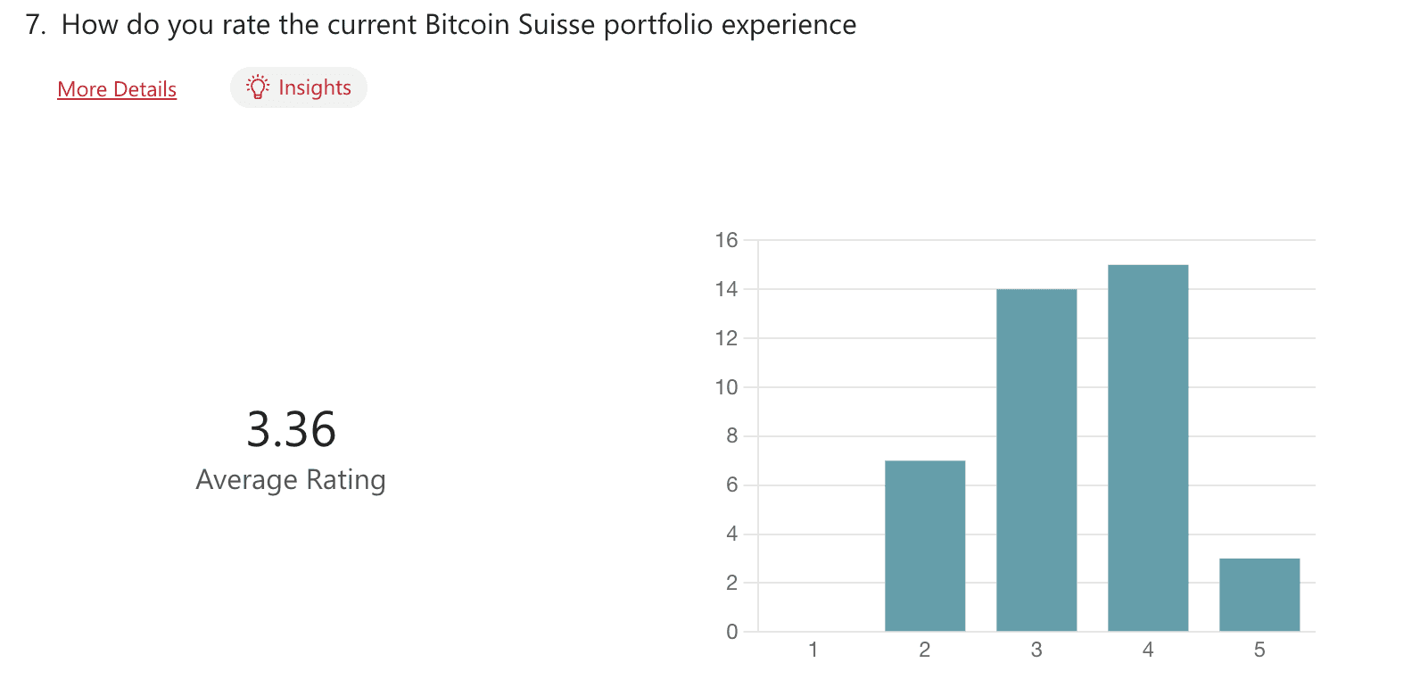
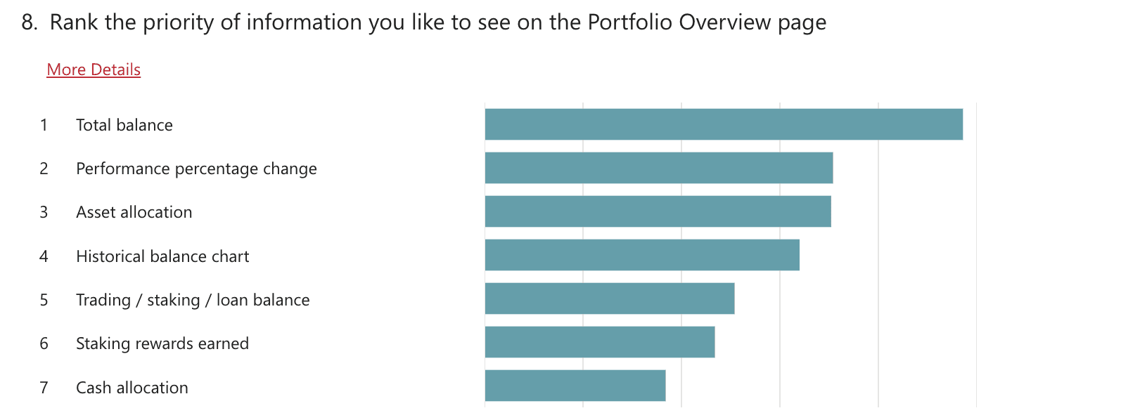
To uncover what users truly needed, we surveyed over 200 colleagues from various crypto experience levels. Their honest feedback highlighted the features they felt were missing from the platform.
Qualitative research
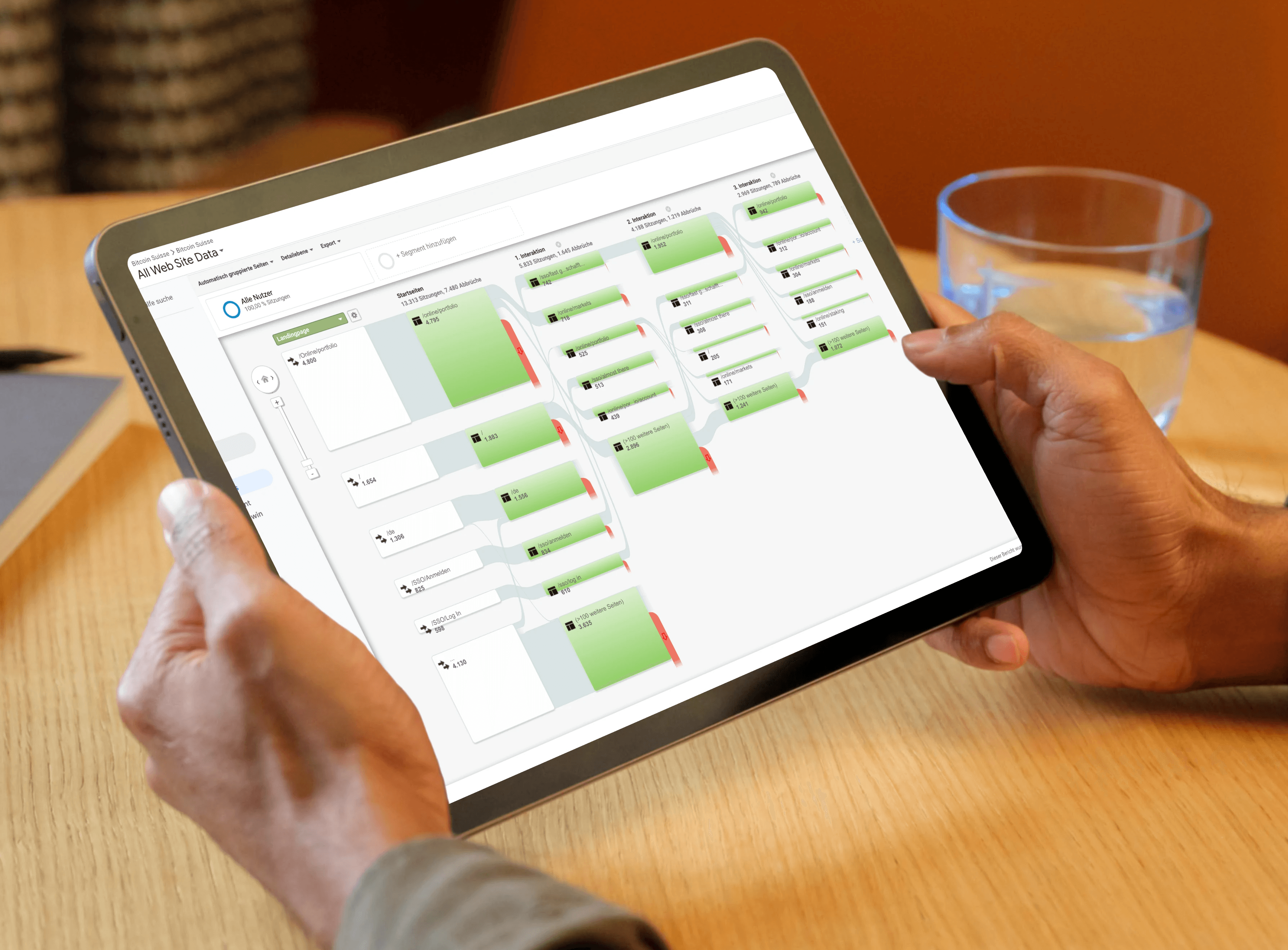
GA user flow analysis
User journeys were tracked in Google Analytics, revealing where visitors left the site. These findings shaped the focus of improvements, ensuring changes targeted the most critical points.
Quantitative Research
Interviews and Surveys
To uncover what users truly needed, we surveyed over 200 colleagues from various crypto experience levels. Their honest feedback highlighted the features they felt were missing from the platform.
After learning who our survey respondents were, we dug deeper into their stories. Their insights gave us a fresh perspective and shaped the next steps in our research.
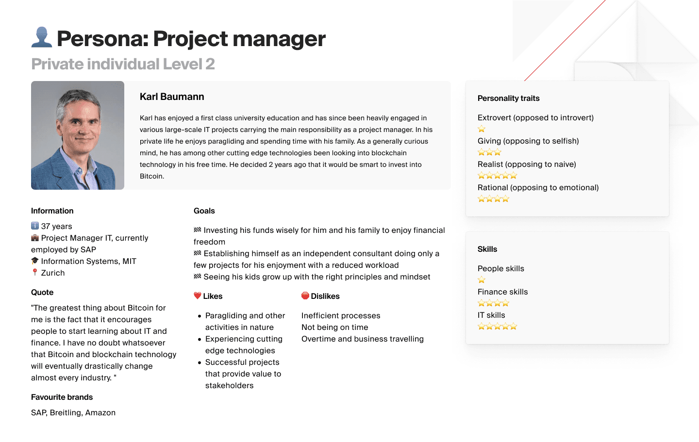
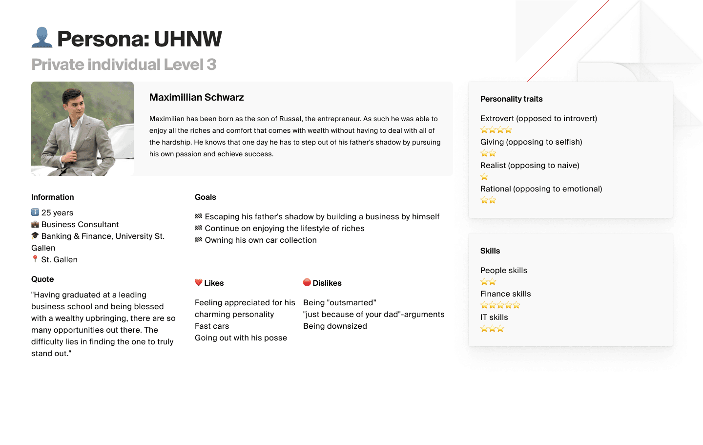
Restructuring client groups to Level groups
PERSONAS AND USER JOURNEYS
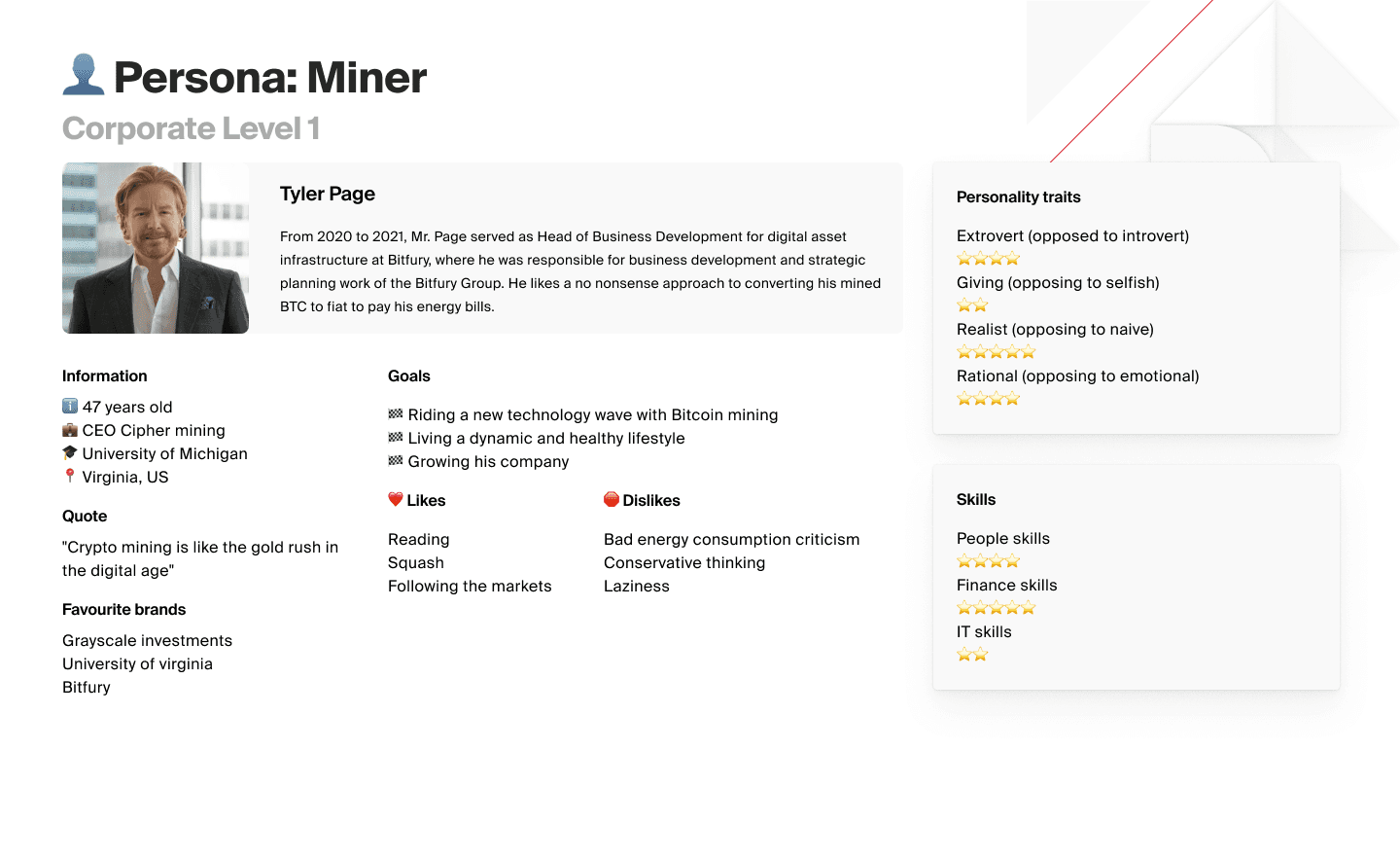
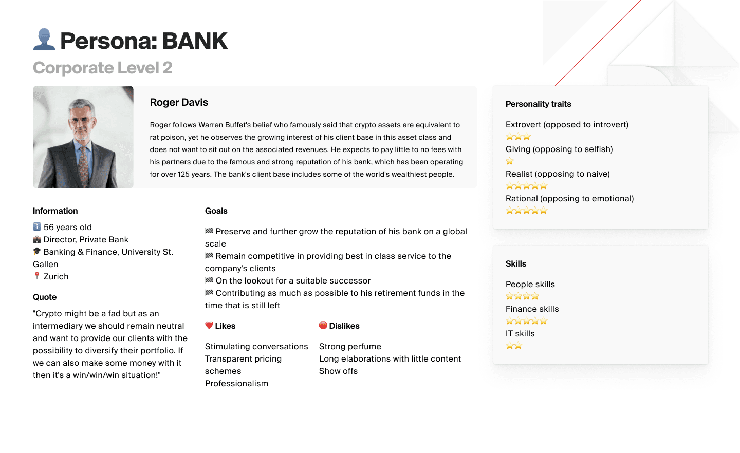
Next, we mapped out our key user groups with help from our relationship managers to better understand real needs and goals.
Our research highlighted two main client types: private individuals and corporate clients. Within each, we identified three user levels based on complexity of needs.
Private individual clients
Corporate clients
We also discovered diverse sub-groups such as hodlers, mining companies, traders, and beginners, each with unique challenges. This helped us shape journeys that truly fit every user we serve.
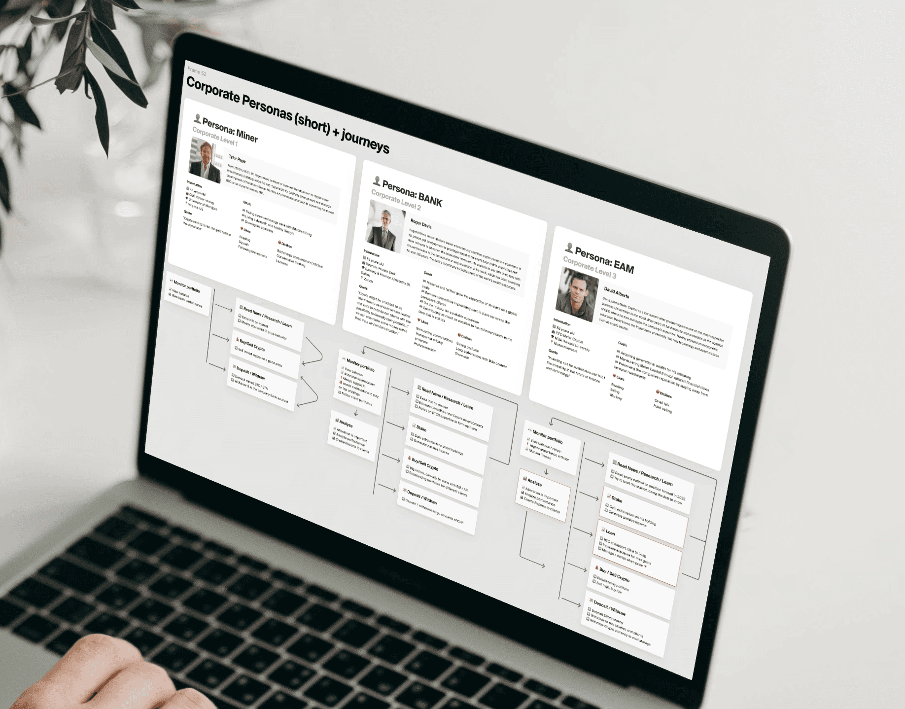
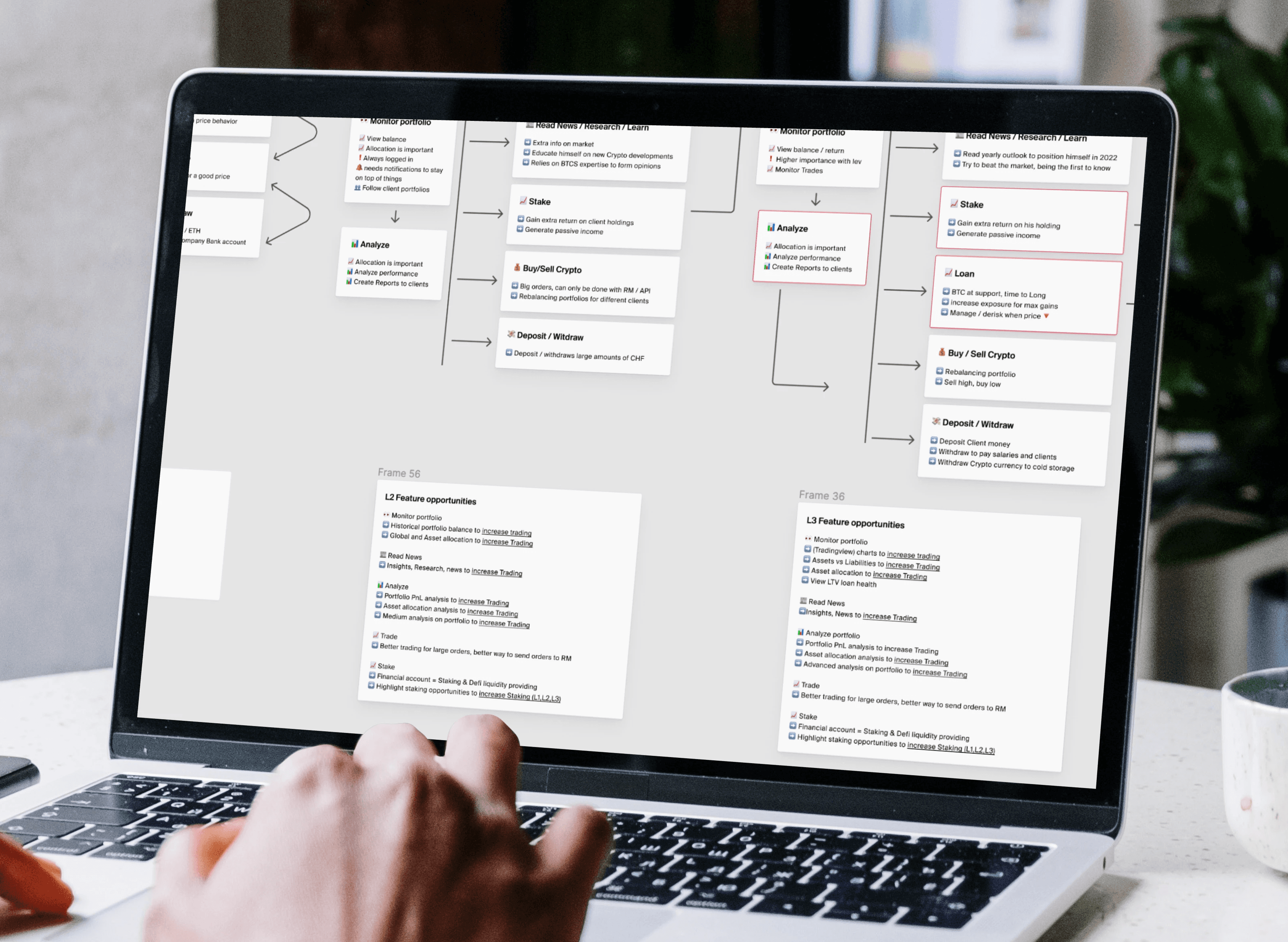
Private/Corporate Client Group Journeys and Feature opportunities
After creating summarized versions of our personas, I created a common user flow each of these users might follow and derived feature opportunities from this.
We mapped journeys for our corporate personas and identified key features tailored to each complexity level. This allowed us to spot unique opportunities to meet our clients’ specific needs at every stage.
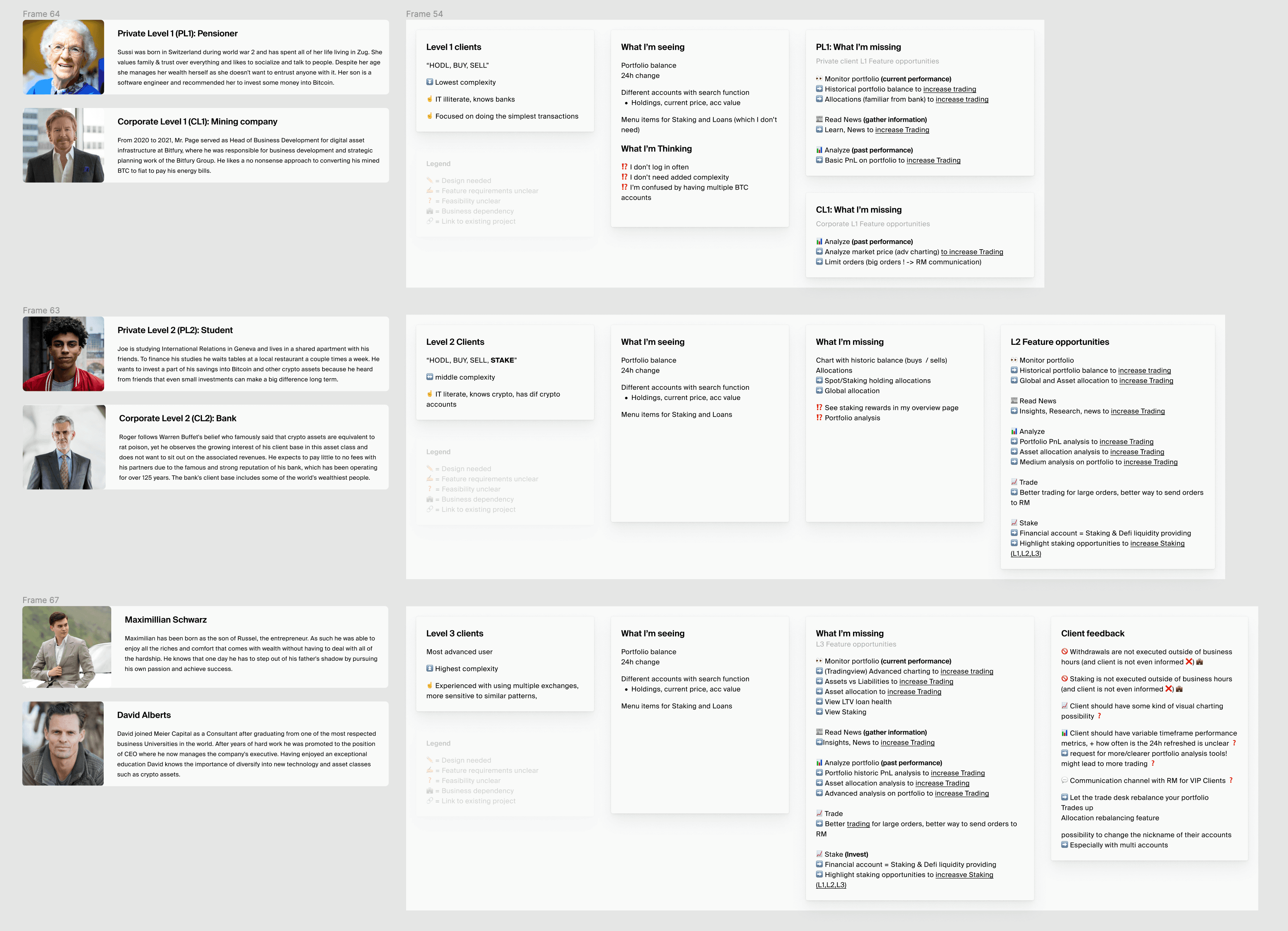
Restructuring client groups to Level groups
To identify feature opportunity overlaps between our Corporate and Private Individual Clients we can now add the "Haves, needs and opportunities" model:
What the user has
What he thinks
What the user needs / is missing
From this, we can list the feature opportunities across complexity levels 1, 2, and 3
From this schematic, and in sync with our initial research we can identify the final Feature Requirements
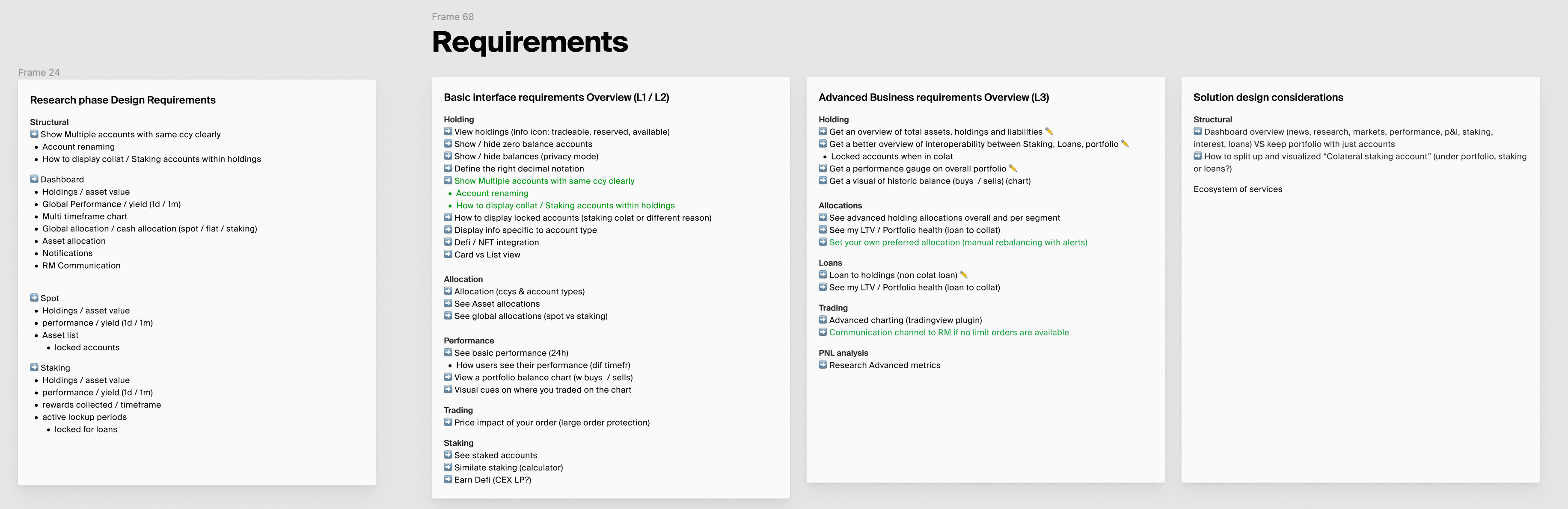
Requirements definition
After completing research, I focused on addressing key issues:
Reduce decimals on cryptocurrency values
Streamline left navigation by merging staking, portfolio, and vault into a single "holdings" section
Update loan and asset logic to prevent negative portfolio totals for users with loans
Add portfolio analysis for advanced users
Enable multi-account support so clients can hold multiple accounts in the same currency
De-designing, Wireframes, and User Flows
RESEARCH
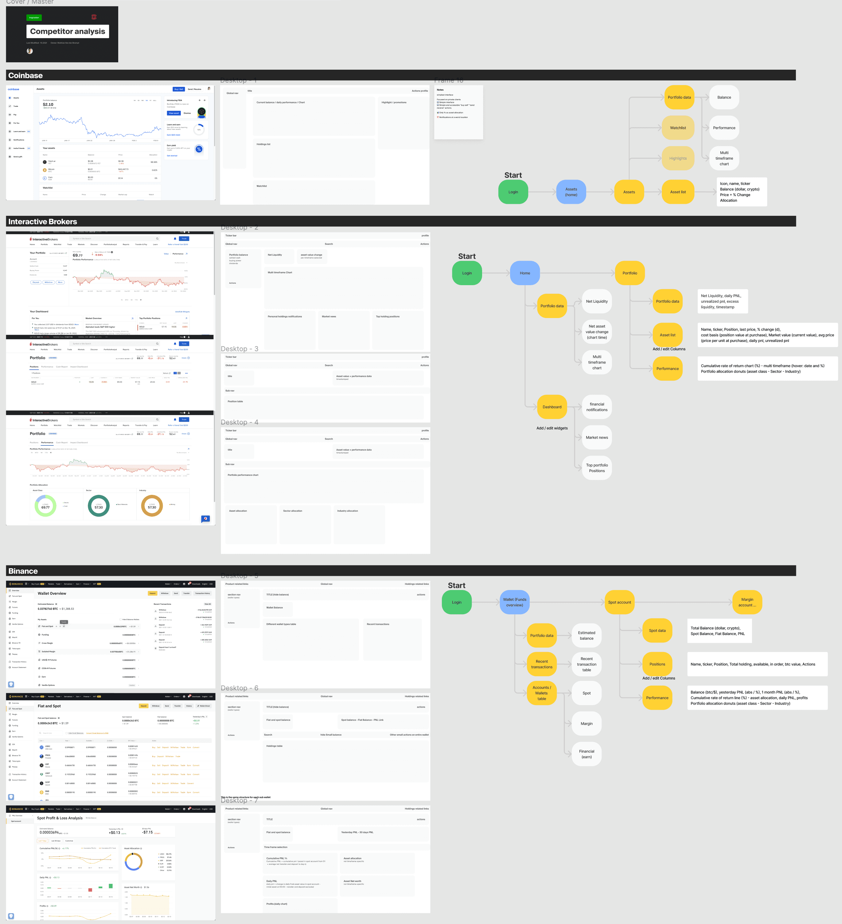
By deconstructing or "De-designing" the interfaces of our competitors, this analysis gave us some insight into the structure and data that were most common for portfolio analysis pages.
I analyzed competitors and similar applications to see what the general portfolio composition looks like. For every competitor, I added a screenshot, a wireframe, and a user flow for our reference. I also went in-depth on the data points they offered in their interface
Competitor analysis
I analyzed competitors and similar applications to see what the general portfolio composition looks like. For every competitor, I added a screenshot, a wireframe, and a user flow for our reference. I also went in-depth on the data points they offered in their interface
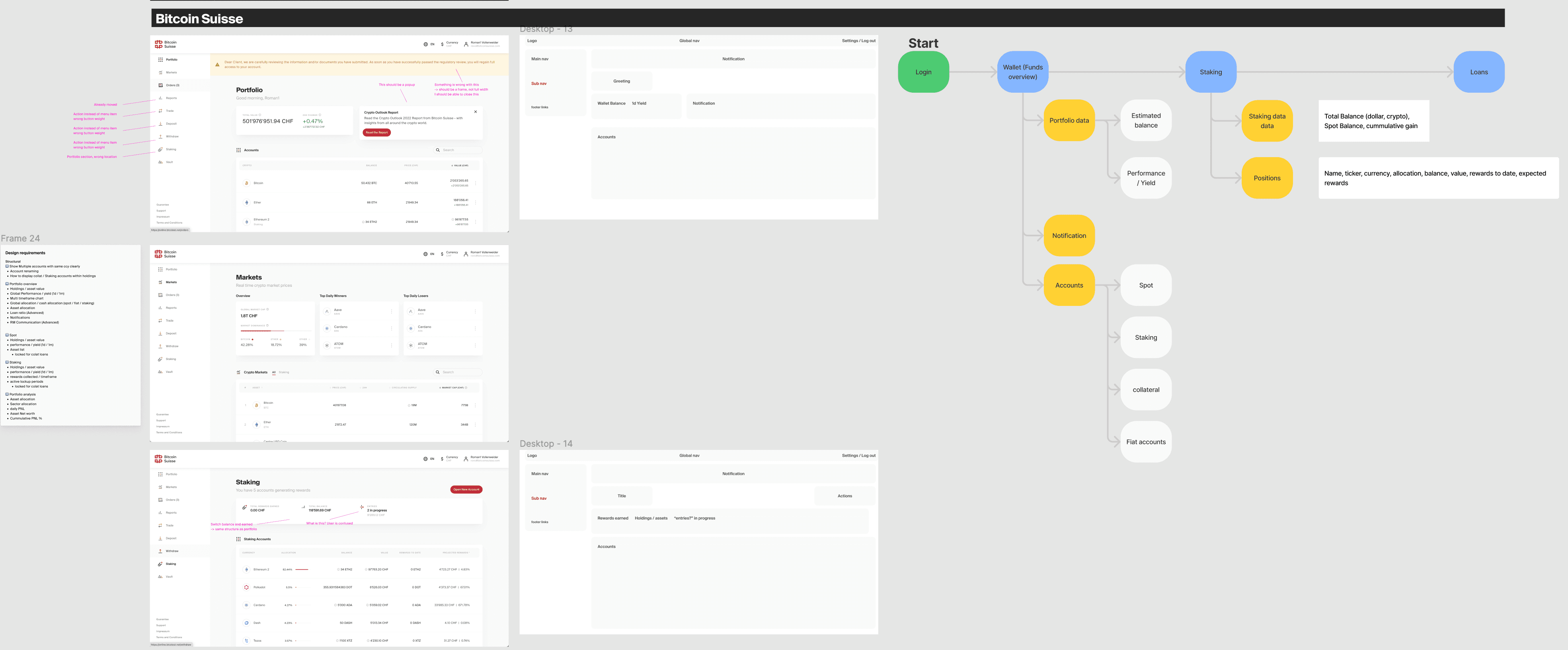
Deconstructing our own platform
As with competitors, I did the same with our own platform, deconstructing it and analyzing it in comparison to our competitors. It became clear that it needed to be reviewed structurally.
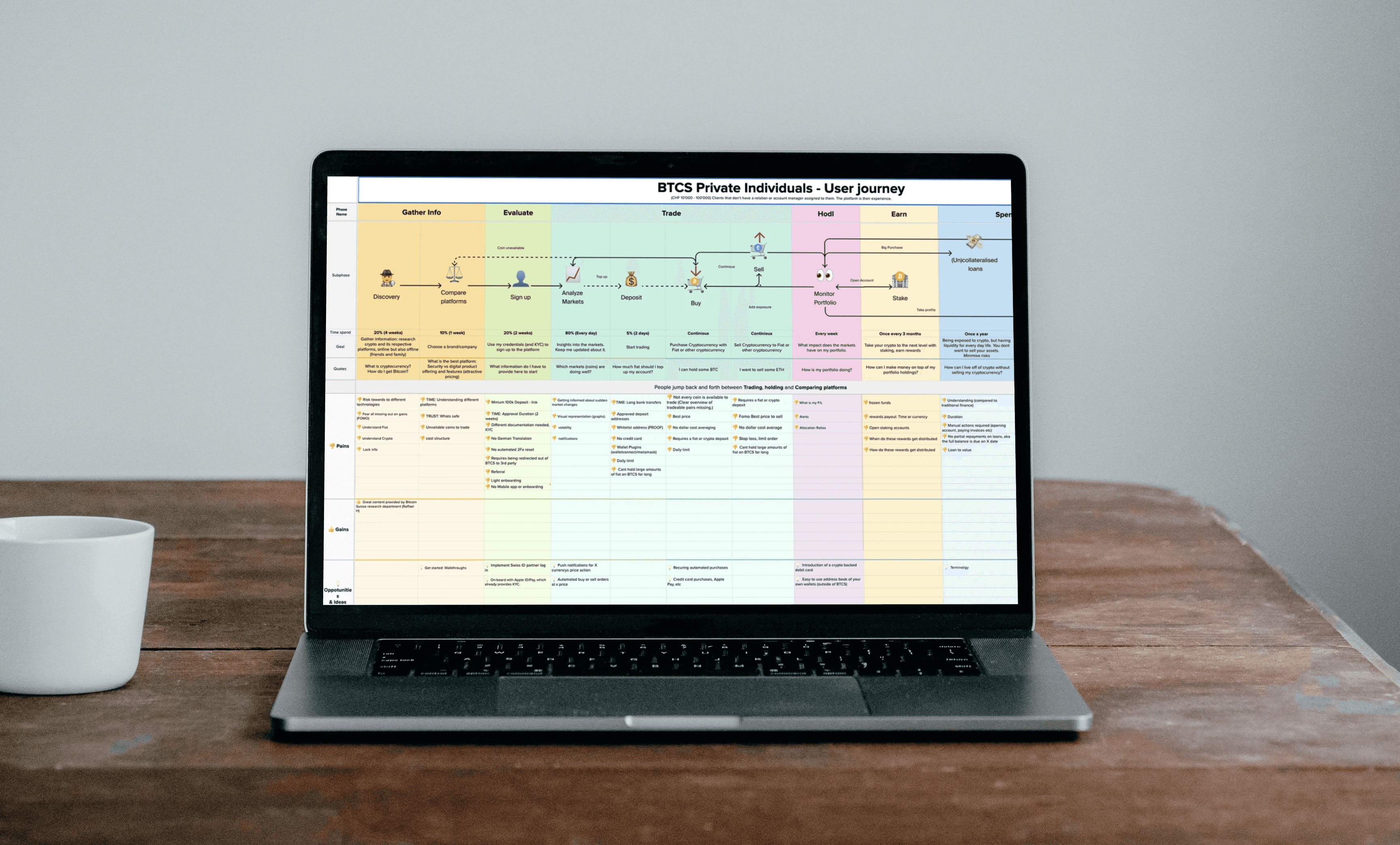
Private individual user journey
We created a user journey for our private individual clients, covering the basic functionality most users will experience. This gave us another great insight in wants and needs.
Crafting the final UI through collaboration and iteration
UI DESIGN
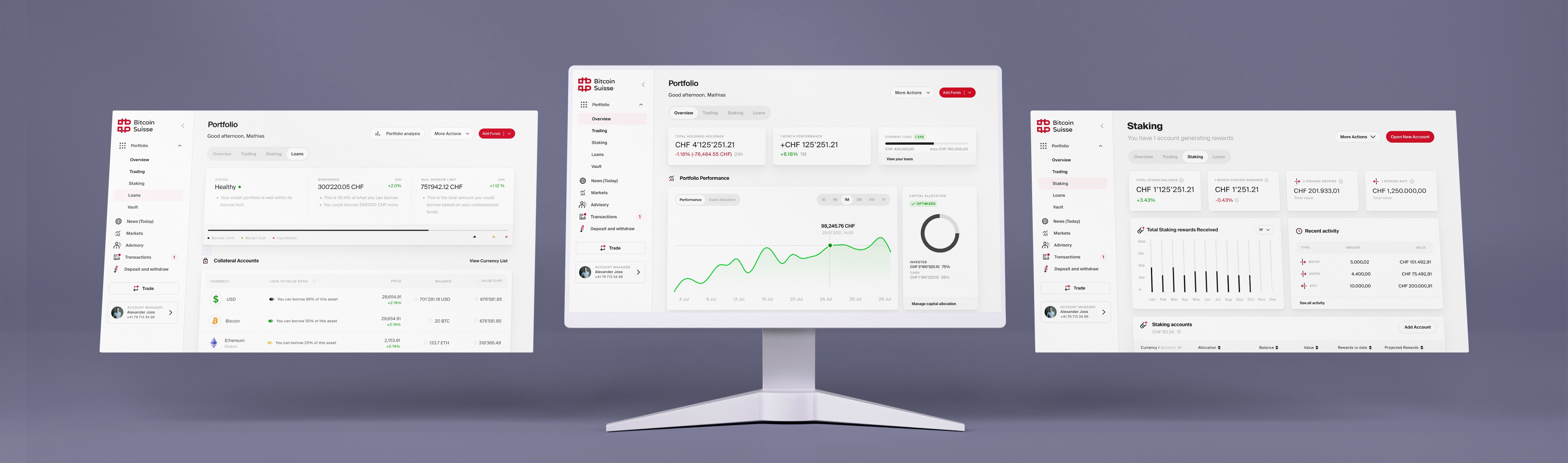
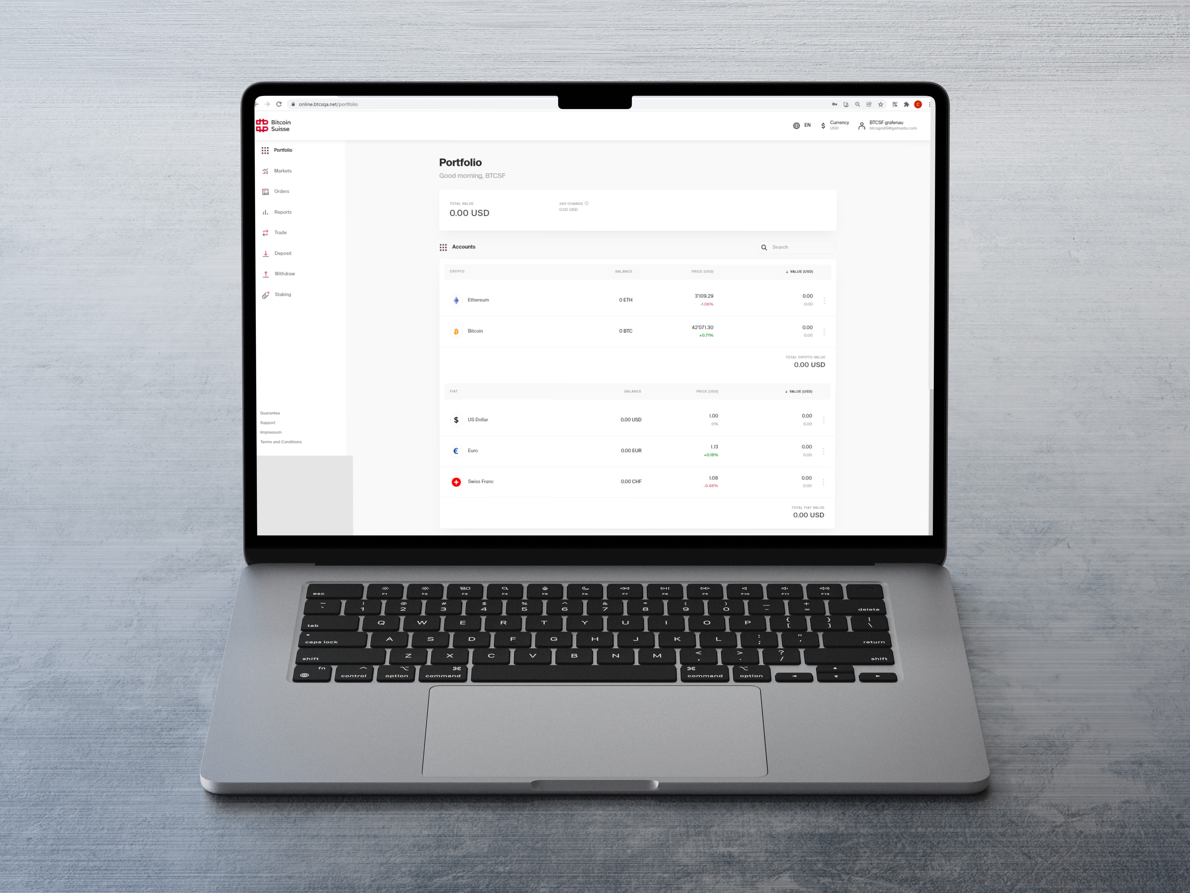
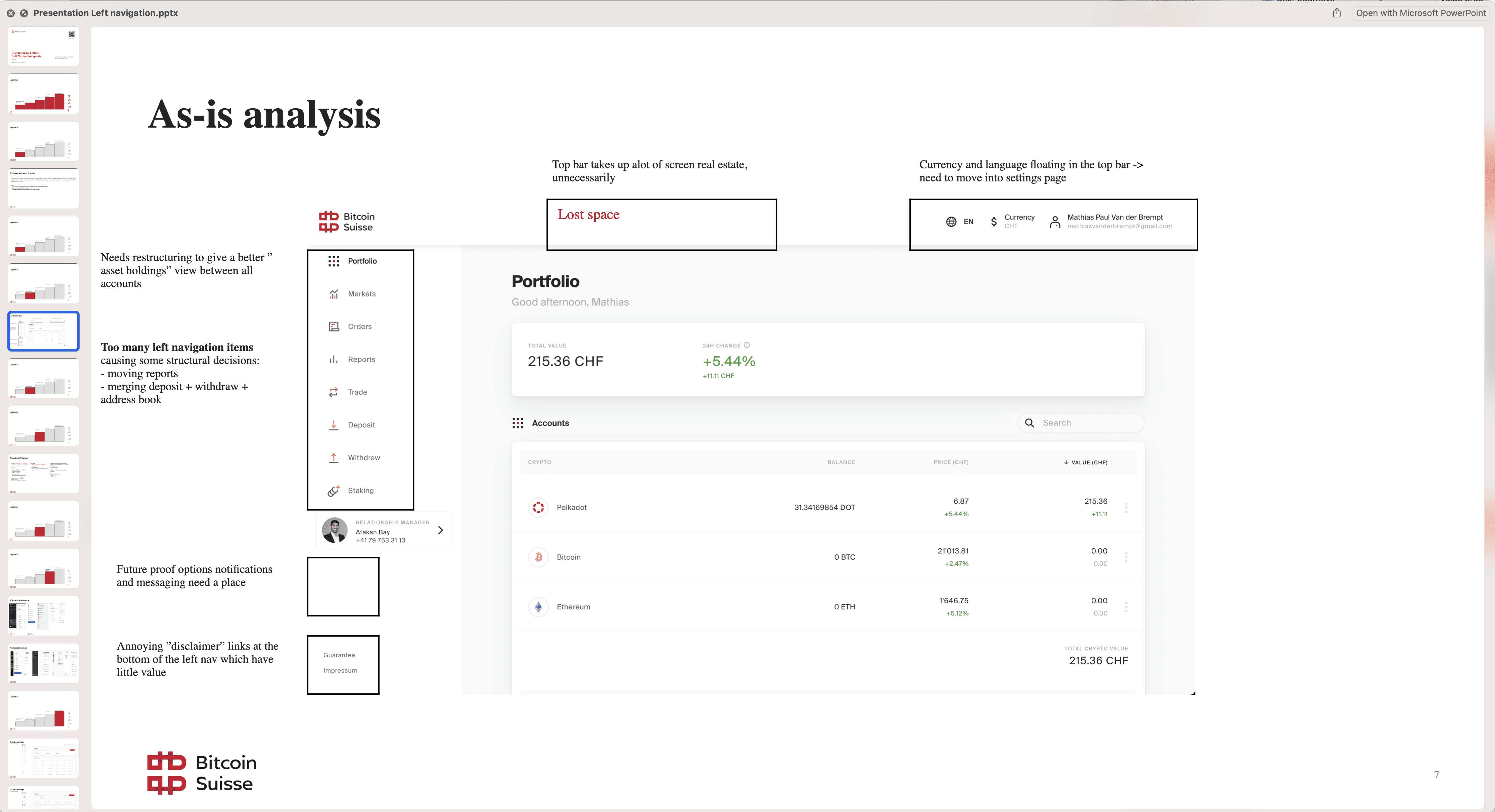
Building on earlier work, I actively discussed feedback from my design manager, refining and improving the UI at each step. Through this collaborative process, we arrived at the final designs, ensuring every detail was thoughtfully considered. For comparison, here's the original design of the portfolio section on the left. Needless to say, users mentioned a huge improvement when we released then new version (right)
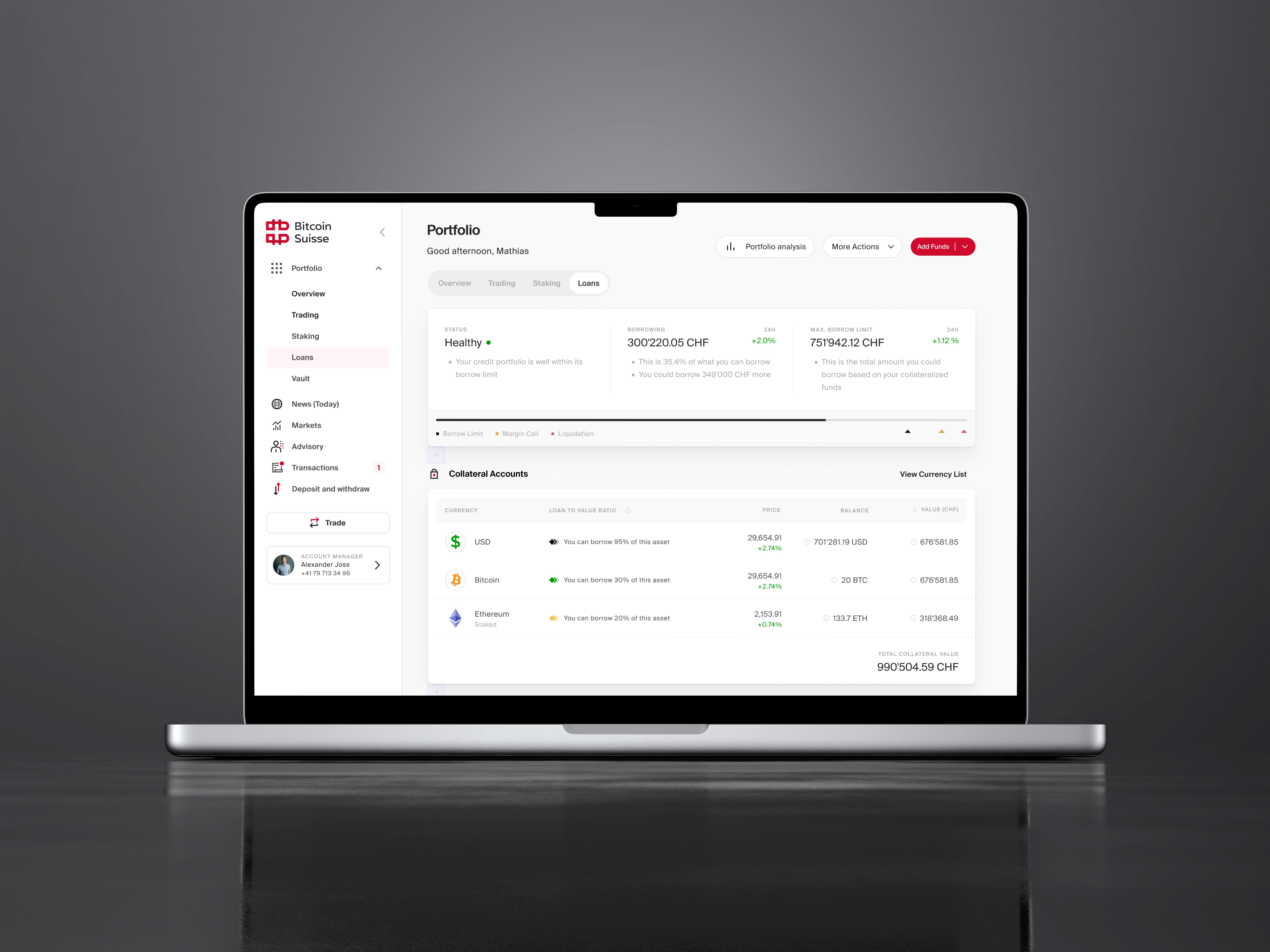
The loans page was designed using an iterative process
Redesigning the Left navigation
FEATURE DESIGN
Transforming navigation to unlock portfolio value
Problem: The left navigation felt disjointed and failed to highlight the portfolio's strengths. Recognizing this, I led the effort to rethink and restructure our navigation, aiming to deliver a more cohesive and valuable user experience. I presented this issue to a group of stakeholders.
Redesigning the left navigation
Solution: All assets are now consolidated under "portfolio", deposit and withdraw becomes part of the same page, and trade becomes an actionable button. This structure works way better for consolidating assets.
Outcomes and Business impact
Making crypto values easier to read by simplifying decimals
The challenge I faced: Users were overwhelmed by long strings of decimal numbers when viewing crypto values, making even simple transactions feel complicated and hard to follow.
My approach: I decided to simplify the experience by limiting decimals to just 1 cent of currency value. This small change dramatically improved readability, helping users feel more confident and less intimidated when managing their crypto assets.
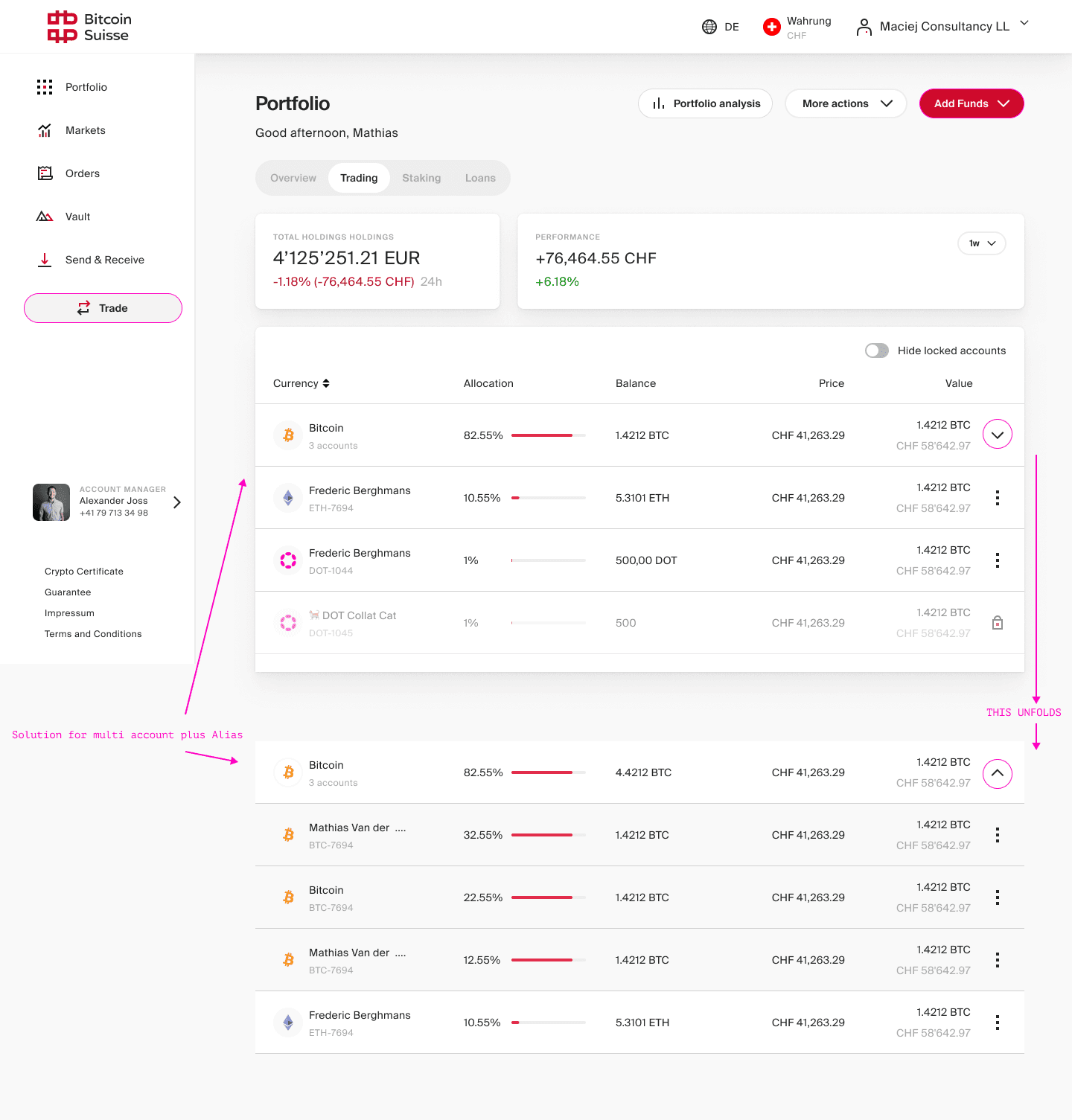
Solving confusion with multiple same-currency accounts
Managing several accounts in the same currency used to be frustrating for users, as there was no easy way to tell them apart in a list. I set out to tackle this problem by designing an identification system that adapts to the number of accounts a user has.
If a user has just one account, the top level displays the account's alias alongside the currency logo for quick recognition.
The account number appears in a sublabel, adding a secondary layer of identification.
When multiple accounts exist in the same currency, the currency name is emphasized at the top, and the sublabel shows how many accounts are available.
Expanding the list reveals all relevant accounts, each clearly labeled with its alias and number—making navigation simple and intuitive.
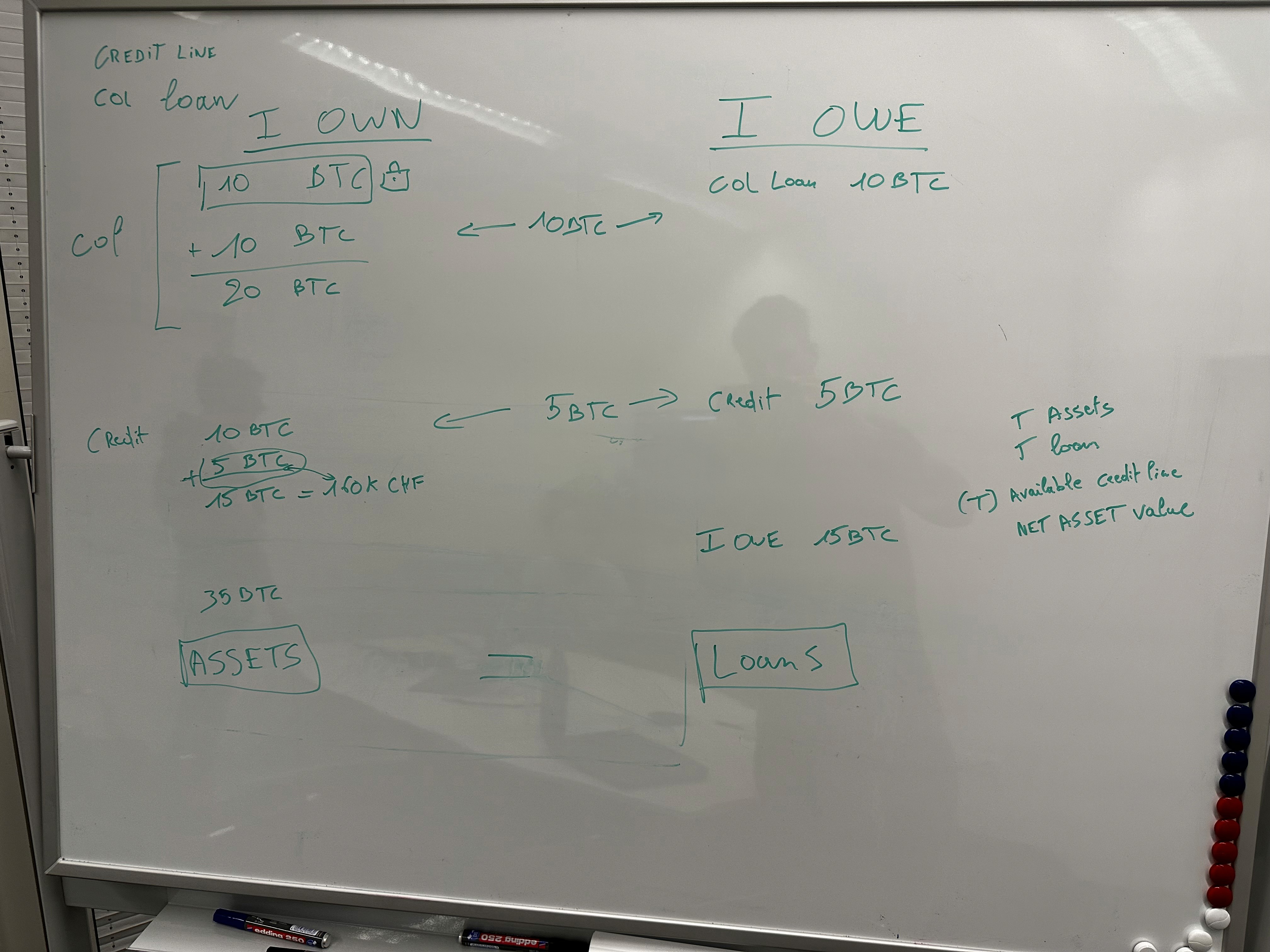
Transforming how loans and assets are presented for clarity
The challenge: Making sense of negative balances in client portfolios
Some of our clients were confused when their portfolios with active loans showed a negative balance. The system simply subtracted their loans from their total holdings, resulting in a message that read, "you owe Bitcoin Suisse." This wasn’t just misleading—it made it hard for clients to get a true picture of their financial position.
The breakthrough: A clearer, more transparent portfolio structure
To address this, I redesigned the way loans and assets are displayed. Instead of deducting loans directly from assets, each loan now appears as a liability under a new "loans" section, while the full value of assets remains visible. This adjustment makes it easy for clients to understand both what they own and what they owe, providing a more accurate and reassuring overview of their portfolios.
Conclusion
I'm very proud of a successful end result where we solved many problems our users were facing while using the portfolio section of our platform.
Improved left navigation that's future proof
Better overall holdings overview
Fixed clarification on crypto decimal notation
No more negative balances when taking out a loan
A multi-account system that's usable
Graphical performance metrics throughout the interface
More balanced information, better use of space
Key takeaways from this project
The value of teamwork: Collaborating closely with my product team and design lead allowed me to approach the research phase with depth and focus. Their feedback sharpened my understanding of both user needs and business goals.
Defining clear requirements: I learned how essential it is to clarify and document requirements at the outset, especially when multiple user groups are involved. This clarity prevented confusion and set the foundation for effective solutions.
Managing scope with confidence: By outlining problems early and aligning with stakeholders, I was able to safeguard the project scope and minimize unexpected shifts. This helped keep the team focused and the project on track.
Adapting to complexity: Handling diverse user needs challenged me to think more strategically about design decisions, making me more adaptable and resilient as a designer.
This project pushed me out of my comfort zone and gave me valuable experience in balancing stakeholder expectations, user needs, and business objectives. I came away with not only new skills but also a deeper appreciation for collaborative problem-solving in design.

