DATE
2025
BlockSensai: AI-driven Crypto Risk Intelligence for Institutions.
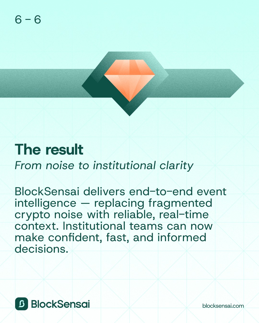
Designed a platform that converts chaotic governance data into a trustworthy, auditable impact model with AI, that decision-makers can understand and act on, without changing their stack.
Risk management
Crypto
Role
Lead Product Designer
Category
Risk Platform
Company
21Shares
Tools
Figma, Notion, Linear, ChatGPT, Langsmith
Team
6 Engineers, 3 Data scientists, 1 Product manager
Timeline
10 months (MVP to Alpha)
Overview
As Lead Product Designer, I designed BlockSensai end to end. I ran focused discovery with each role, rebuilt the data model into a clear user-centric taxonomy, and shaped proposal-level groupings with proven source attribution and confidence signals. I designed dense dashboards and analysis modules, standardized card types, and built an accessible light/dark design system that could ship quickly in six-week cycles. I wrote detailed tickets and implementation guides, aligned the UI tightly with the data model, and set up QA checkpoints to prevent drift. This improved feed scanning, prioritisation speed, and impact comprehension across 30+ protocols.
Problem
Governance data across Ethereum, Solana, and 30+ protocols lived in forums, GitHub threads, and scattered feeds. The content was full of jargon, inconsistent tags, and overlapping labels, which made it hard for analysts and fund managers to understand what mattered. They had no reliable way to track proposals, interpret impact, or keep up with fast-moving news. High time-to-completion and unclear signals increased uncertainty, while mixed content feeds blurred context, reduced trust in AI summaries, and made it slow to spot what required attention.
Opportunity
Create a user-centric classification and correlation model with clear provenance and confidence. Separate proposal impact from event impact, and support role-specific evaluation for fund managers, analysts, traders, and researchers. Host proposal data cleanly at the proposal level to reduce side-panel overload, introduce consistent card types for fast scanning, and support API and permissioning routes so teams can review updates in the tools they already use.


My impact
Research and analysis
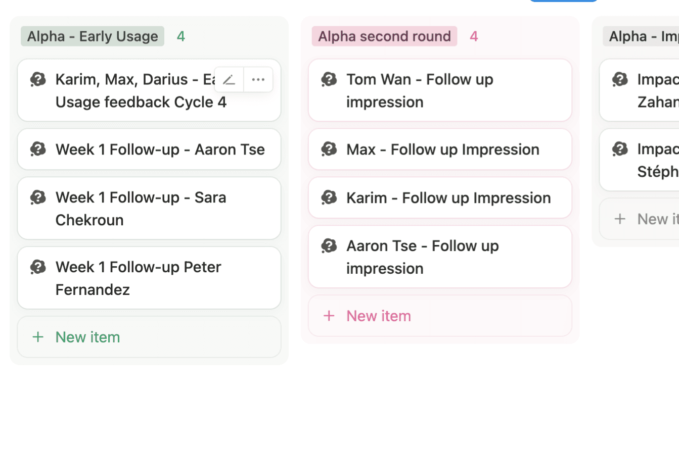
Ran user interviews and tests, then analysed findings with AI into a weighted priority list.

Concept designs
Created first interface concepts based on the idea, the greater vision and research insights.
Data Structure
Reworked the data classification framework the Product and Engineering team was stuck on.
App Architecture
Defined the core application architecture and how the main data flows connect.

Color system
Built out a color system with documentation that supports light and dark mode.
Design system
Created a component library and design guidelines for consistent product-wide use.

Engineering support
Scoped designs with engineering, aligned on frameworks and solved constraints together.
Process-driven delivery
Supported front-end delivery by anticipating issues and adjusting workflows early.

Process
6-week cycles
We ran fast, six‑week cycles that combined role‑based research, pragmatic scoping, and tight delivery. No room for "UI polish". Each loop turned raw governance data into a testable experience, validated with usability sessions, then shipped through governed components and detailed handoffs to data science and engineering.
Discover
Semi‑structured interviews across five institutional roles surfaced pain around signal vs noise, proposal vs news impact, and workflow fit. Findings were synthesized with AI into consistent artifacts (transcripts, insight summaries, value canvas, priority list).
Define
Scoped a pragmatic PoC in 6 weeks which showed clear user targets measures: feed scanning accuracy, visible provenance and confidence, reduced time‑to‑triage. Requirements explicitly separated proposal impact from event/news impact and established role‑based views.
Build
Reworked classification and event segmentation, documented a user‑centric taxonomy, and produced a design system (tokens, components, patterns) for light/dark and dense data UI. Designed the app, and authored detailed tickets and implementation guides; kept responsive adjustments minimal to preserve consistency.
Discovery and early concepts
RESEARCH
Before designing the first version of BlockSensai, we needed to understand how institutional users deal with governance and risk information today. The goal of this phase was to uncover their real workflow challenges, map how decisions are made across different roles and explore possible product directions. This research helped us prioritise what mattered most, test early ideas quickly and gather the clarity we needed for the data architecture phase that followed.
Interviews
Discovery
We needed to quickly define a clear concept while exploring user needs. By running brainstorming sessions and workshops, we created a vision that balanced user insights with business goals. Ongoing feedback and iteration helped us refine this idea into a workable proof of concept, keeping our approach flexible as we moved forward.
Walk-through
Concept design
Based on the discovery findings, and within 6 weeks, I created an early concept that explored different ways of grouping events, showing risk levels and structuring the intelligence feed. We tested these concepts with internal experts and target users to see which direction matched their mental model and fit their daily responsibilities.
The feedback showed what worked, what felt confusing and what needed to be simpler for institutional workflows. These learnings directly shaped the next phase: building a clear data architecture that could support the experience we wanted to deliver.
Designing Clear User-Centric Data
DATA & APP ARCHITECTURE
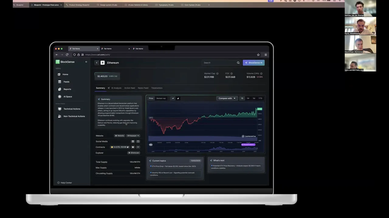
The product’s initial data structure tried to mirror crypto governance forums and technical pipelines (thread types, lifecycle tags, proposal jargon). Users didn’t speak that language; and the non‑governance data we ingested (news, incidents, commercial updates) didn’t fit the model cleanly. Labels overlapped, forum‑specific terms leaked into the UI, and event types were inconsistently applied, making AI‑generated summaries and metrics hard to trust.

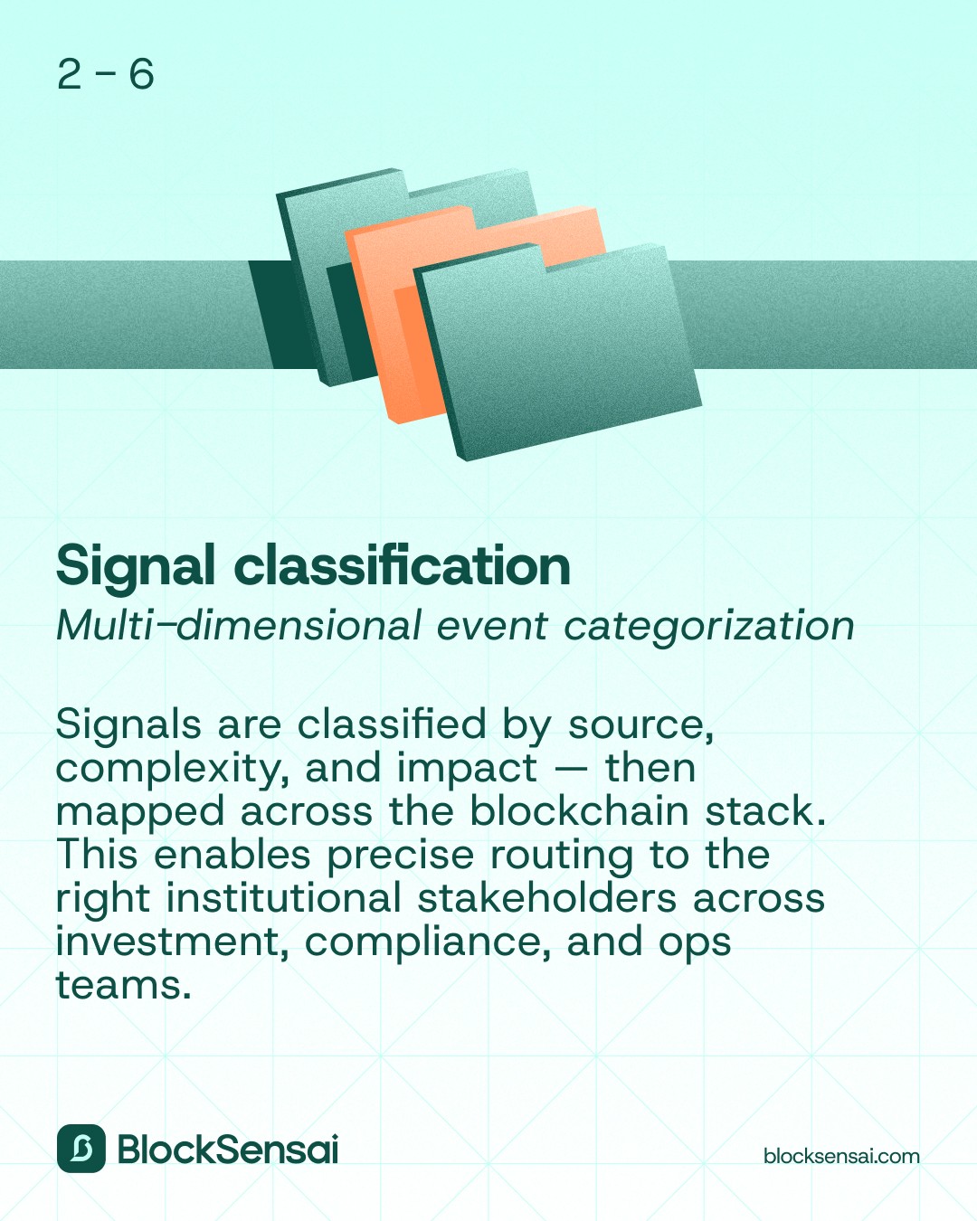
Data Tags & Classification: Untangling forum jargon into a user‑centric data language
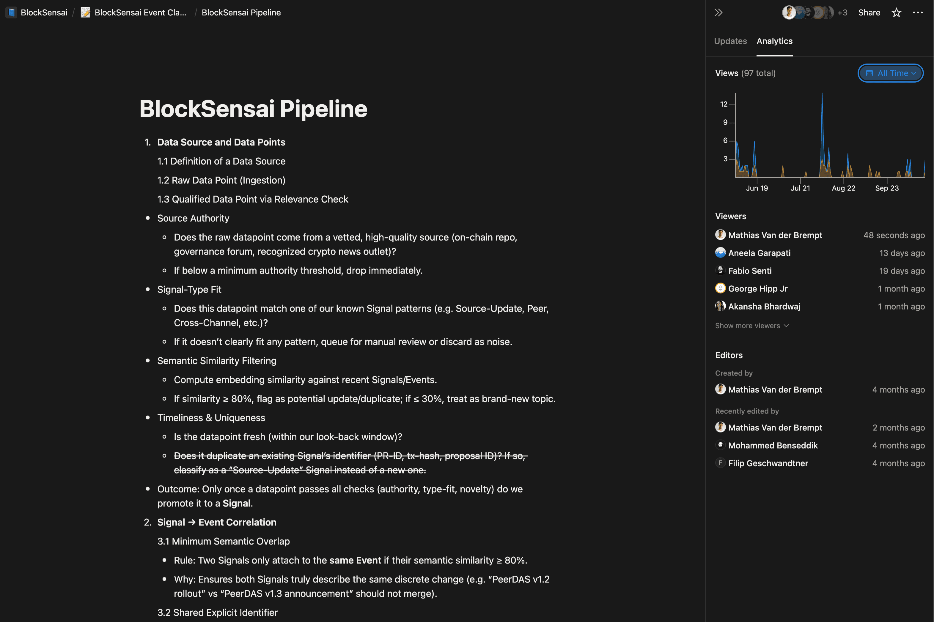
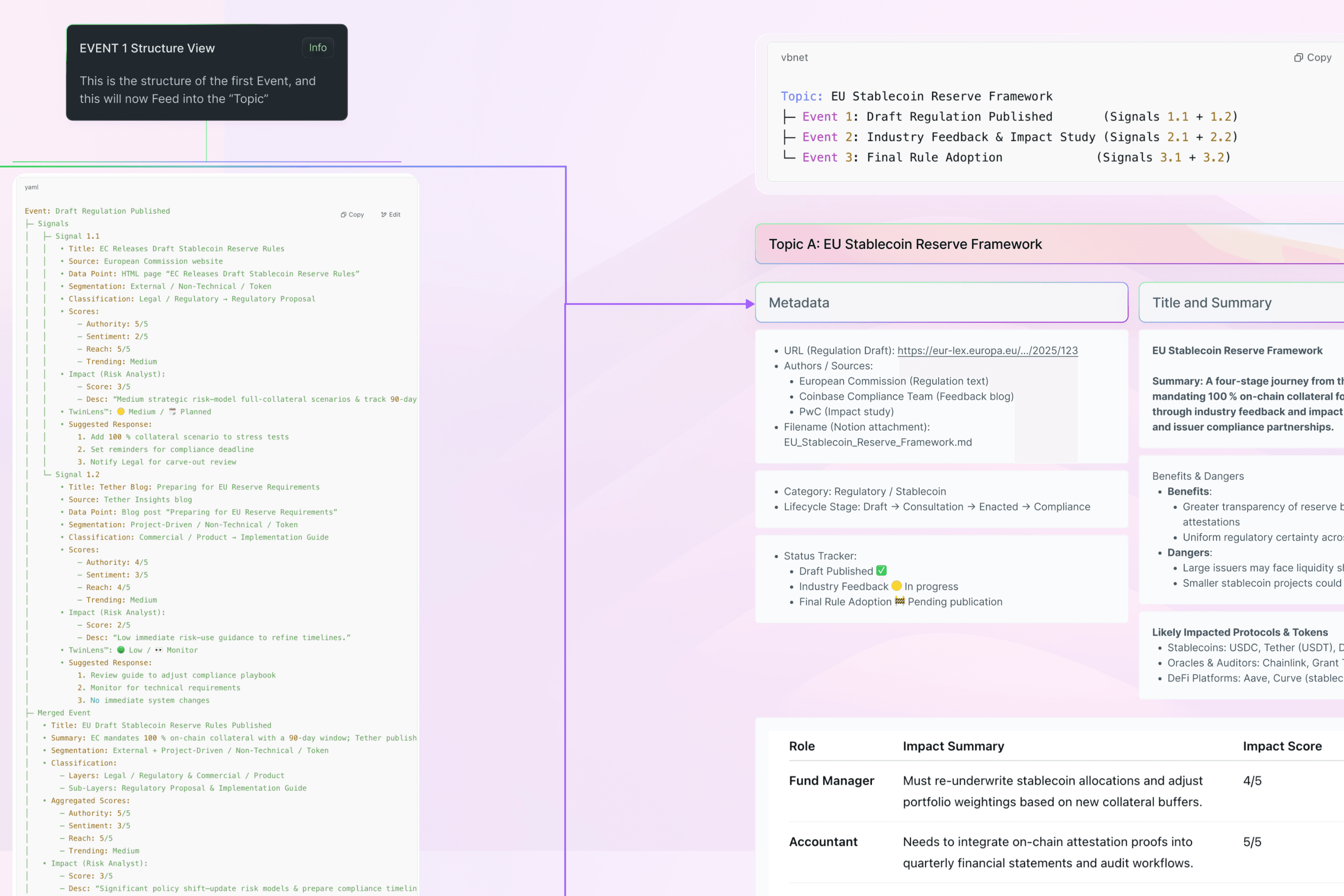
We replaced governance-first and product management driven jargon with a user-centric taxonomy and glossary, then developed an event segmentation model and introduced a classification framework to make behaviors clear. Finally, we added types aligned to lifecycle stages so items are grouped consistently end-to-end.

Documentation on the structure of Data points
I then developed an event segmentation model and introduced a classification framework to make proposal and news items fit into the same Data Classification System, and we could tag items consistently. This is vital for later use of different items in impact calculation, grouping or cross-linking. Finally, we added "Types" aligned to lifecycle stages so items can be consistently presented and grouped in the right lifecycle stage.
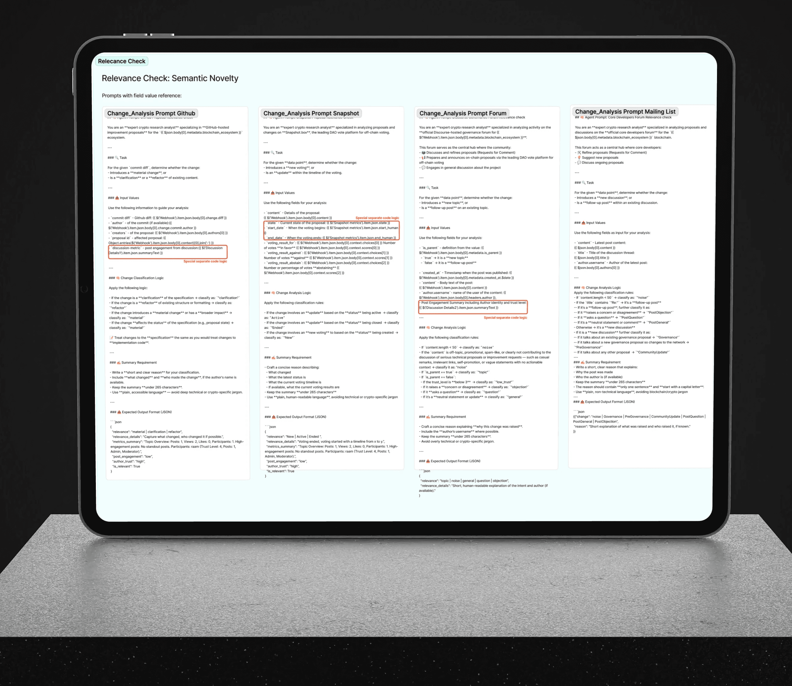
Collaborated on prompt engineering
AI played a prominent role in data processing, as our database was produced by LLM output. We spent alot of time finetuning the prompts to get the right data into the UI.
In the latter stages, I worked on creating a "likelihood of approval" for proposals, which could be the key to unlocking impact and price predictions based on historical events.
Product Design
Scoping the Concept into a Feasible POC
Before running interviews and live usability tests, we narrowed the initial concept into a pragmatic Proof of Concept that the team could build and validate within a single cycle. The goal was to prove the core value quickly—structured, trustworthy governance intelligence—while minimizing complexity that would slow down delivery and learning.

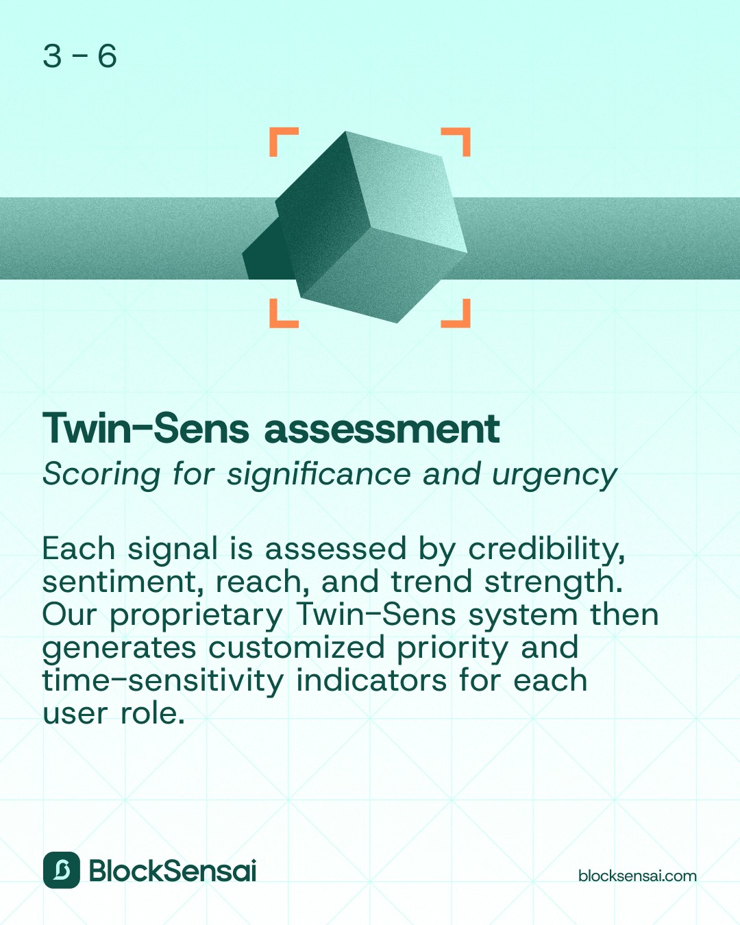
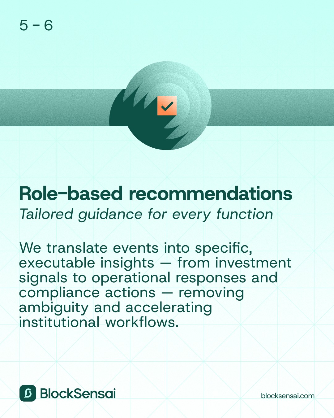
Role‑Based Impact
A primary driver of the product is personalised risk and impact metrics based on your role. We Distinguish impact by type and by role to remove ambiguity and speed decisions.

Future Proof Product Architecture
I built the original documentation on architecture and ensured the end-goal was not lost. To remain flexible through decisions, I kept sections modular and easily moveable.

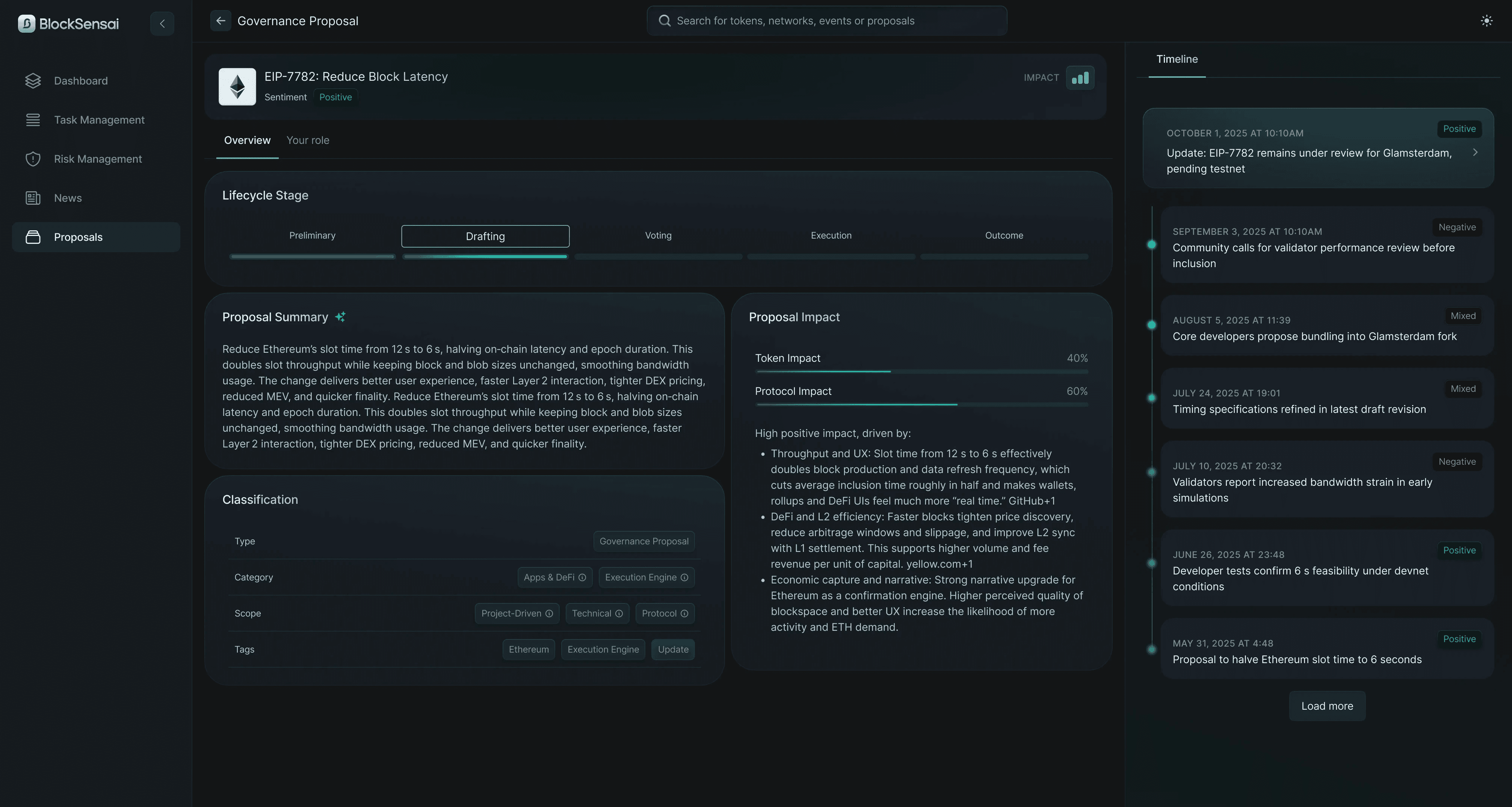
Moving proposal data to a dedicated page
When the user research did show confusion with the former approach, we could easily shift to a consolidated proposal‑level page and reduced event-level duplication. This created a clearer analysis hierarchy and an overall swift solution for this issue.
The clearly seperated news page with impact estimation and "blinkist style" summaries was later pushed into the feed counter to my recommendation.

Color and Design System for faster delivery
DESIGN SYSTEM
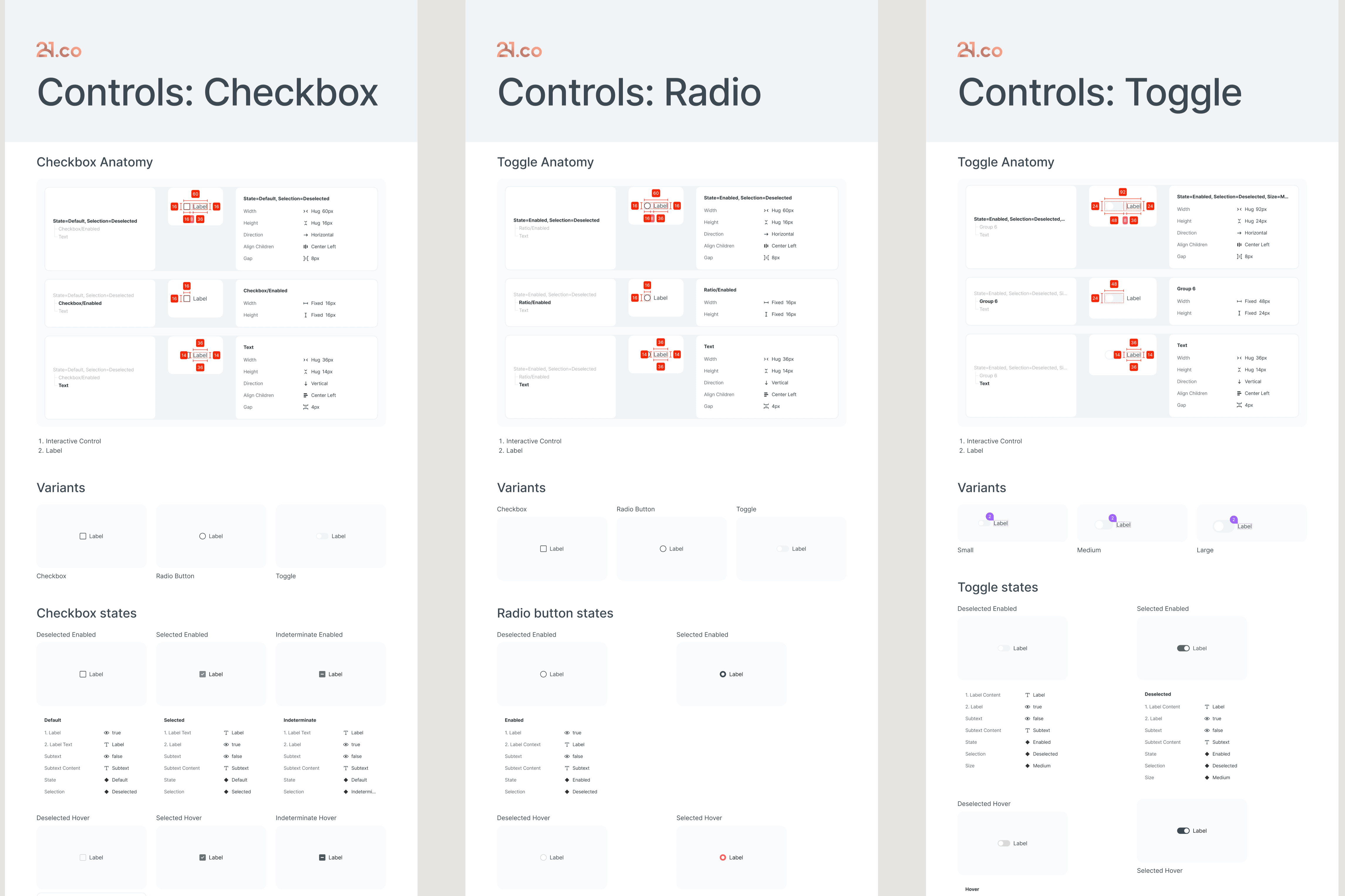
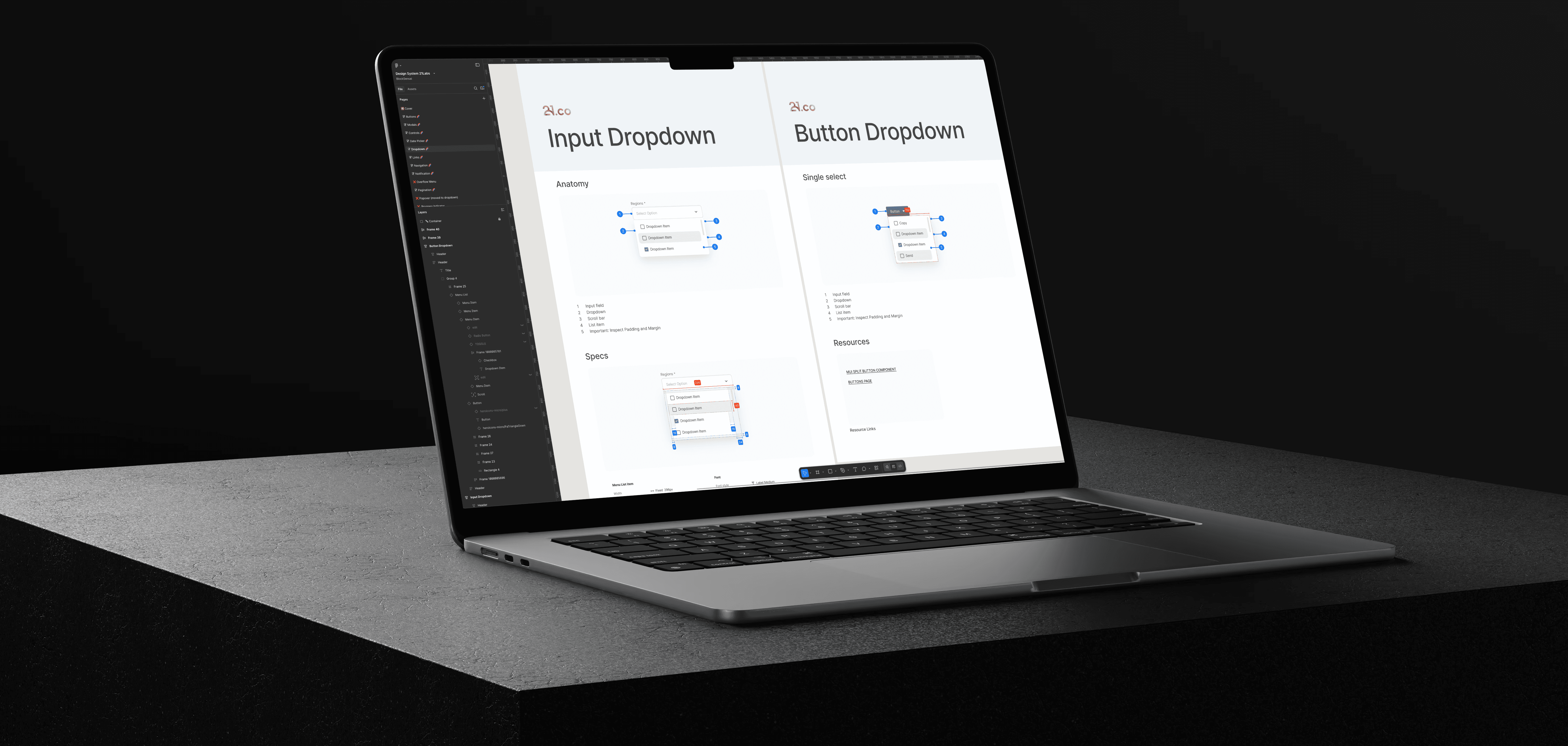
Due to the speed of the project, there was no time for any "UI polish", we were building in "wireframe mode" throughout the project. I built a design system that made dense, data‑heavy UI fast to ship and easy to keep consistent. It includes documented tokens, accessible color scales for light/dark, and governed components for the core surfaces (feed cards, analysis modules, proposal page).
Tokens and foundations
Consistent spacing, typography, and elevation tokens; accessible color palettes for light/dark with contrast targets so content stays readable across complex screens.
Defined patterns for data-types
Standardized card variants (proposal, market, community) and analysis modules with do/don’t rules, states, and usage examples to reduce ambiguity in implementation.
Consistency at speed
Acceptance criteria, checklists, and annotated handoffs helped engineers ship faster without visual drift; small, predefined responsive adjustments kept layouts stable across breakpoints.

Challenges and solutions
Throughout the course of this project, we encountered several noteworthy challenges that required innovative problem solving. Each obstacle pushed me to think creatively and collaborate more closely with the team. Below, I have highlighted some of the most impactful challenges we faced, along with the strategies and solutions I personally implemented to overcome them. These experiences not only strengthened our process but also contributed valuable insights to the overall outcome of the project.

Challenging assumptions to improve impact assessment
In cycle 4, product management proposed merging news, which instantly affects prices, with proposals, whose impact comes only after approval. Seeing a flaw, I drew on months of user interviews and spoke up with firsthand insights. I then reviewed how we display Impact across news and proposal scenarios to better support decisions.
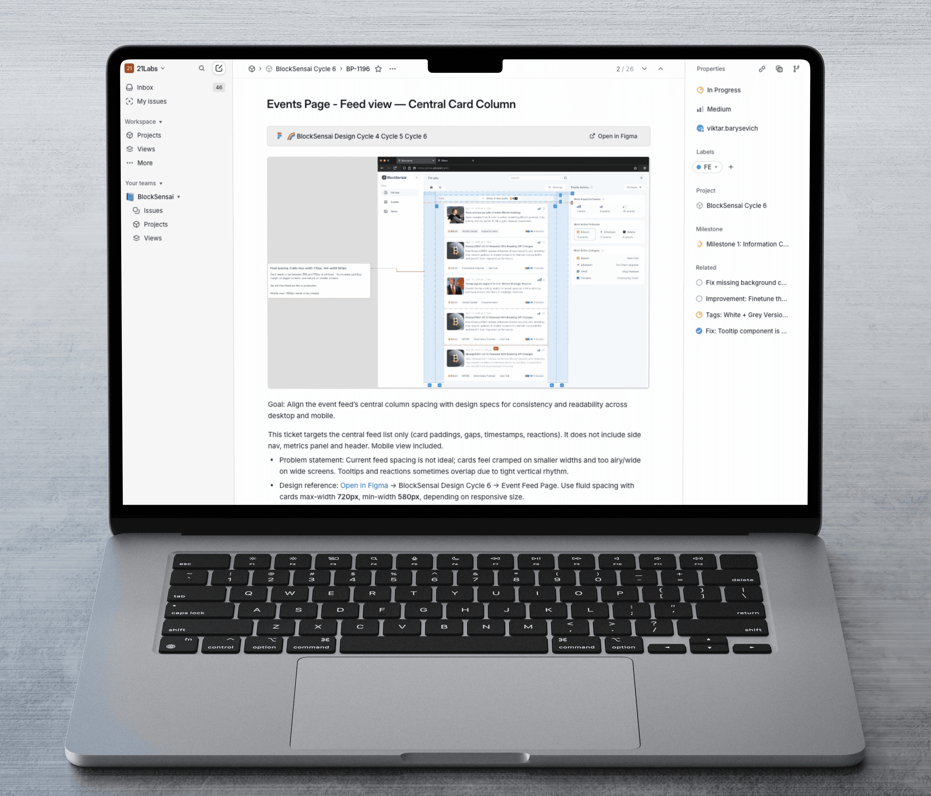
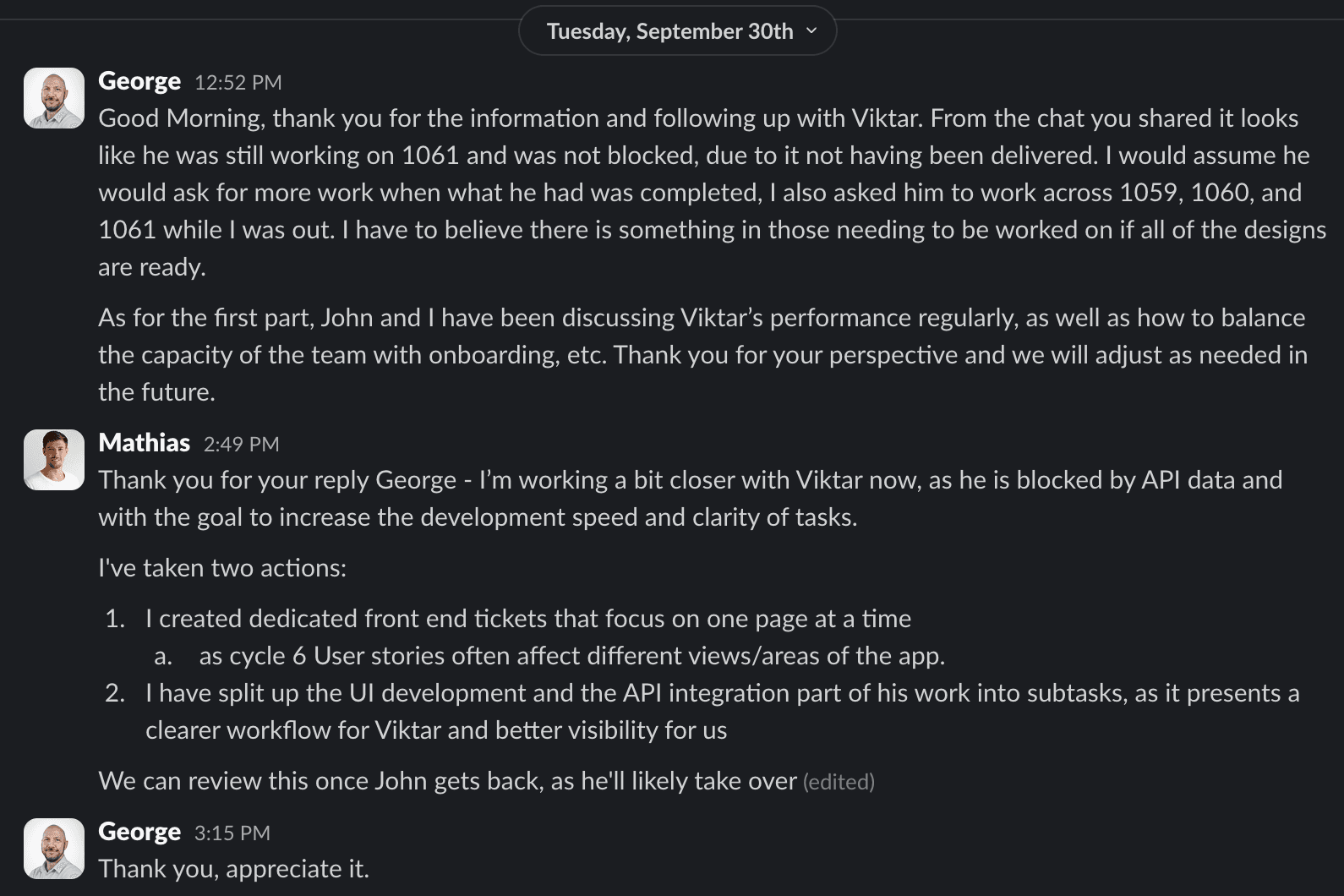
Detailed tickets helped scope clarity
To ensure a smooth implementation, I worked hand in hand with my engineering counterpart, crafting tickets that left no detail unexplored. By anticipating potential questions and clarifying every aspect up front, we aimed to prevent last minute surprises. Regular QA checks and follow-ups became part of our routine, helping us catch issues early and keep the project moving forward.
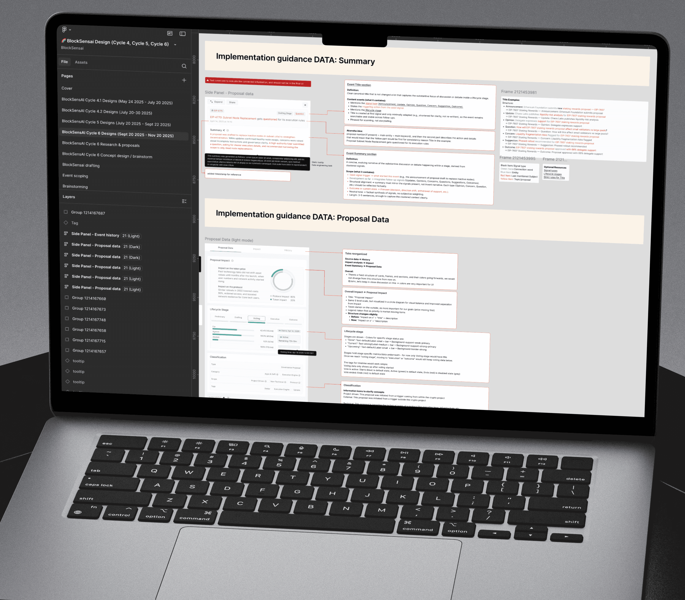
Implementation guides ensured clarity for Data and front-end teams
Considering the extremely complex content we were working with, and the product owner and myself were clearing the path ahead by means of user feedback and design, we had to be extremely detailed in our communication of requirements towards data engineers and development teams.
Outcomes and Business impact
The new data model and design system enabled scalable development and ensured flexibility going forward. User research-driven improvements unlocked positive iteration rounds, moving towards 21.co’s mission to lead in crypto intelligence.
OUTCOME
AI‑produced structured JSON became reliable enough to power feeds, timelines, and metrics across 30+ protocols.
The classification framework enabled consitent data ingestion .
OUTCOME
Faster visual identification of items, clearer impact comprehension, and consistent implementation across surfaces.
I consolidated proposal‑level information and reduced event-level duplication; introduced clear analysis hierarchy.
OUTCOME